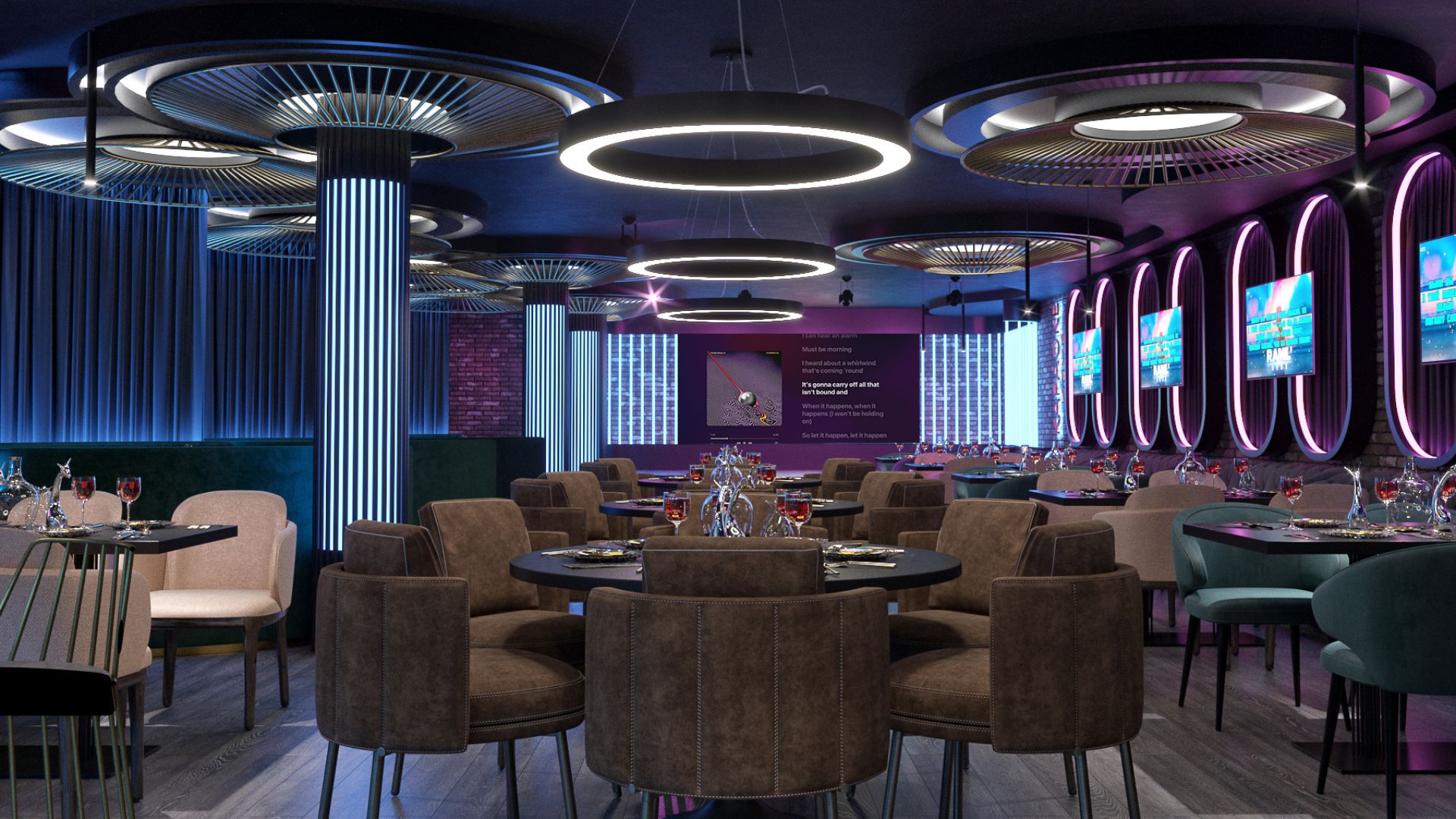
The proportions of a room can have a significant impact on how we feel in it. Spaces with dynamics, such as those that are very elongated uphill or in length, can create an uncomfortable atmosphere that affects our comfort and mood. You can notice this in corridors that you want to pass very quickly and not stop in them. Here’s how to prevent this impact and creatively construct balanced spaces.
Vertical and horizontal lines
The use of vertical and horizontal lines is an important part in correcting unequal spaces. Vertical lines assist in visually raising the ceiling and balancing vision. However, simply painting lines on the walls is insufficient since the entire interior must be built on verticals for a satisfactory effect. That’s what we did in a Karaoke bar in Kyiv that has a low ceiling. Starting from the columns and ending with the curtains, verticals are visible everywhere, which visually raise the room.
Horizontal lines, such as those found on the ceiling or floor, are commonly employed to extend space. Accent lighting also aids in overcoming this disadvantage. In the Wine Tunnel, we added accent lamps that divide the ceiling into certain segments, thereby expanding the tunnel. Horizontal lines, by the way, work best when paired with zoning, which we will explore further belowе.
Zoning space
The division of space into separate zones aids in the creation of a harmonious interior with no sensation of movement or congestion. This is an efficient method of achieving visual balance in a room. Coming back to the Wine Tunnel: we not only added accent lighting, but also divided the space into certain sectors with the help of floor tiles and wine cabinets. In this way, we managed to create certain “zones of interest”, each block has a certain accent: paintings, a cabinet with collectible wines, etc. The dynamics disappear and the client gets a comfortable room for collecting and demonstrating wines to guests. It is important to note that cubic spaces are the most comfortable to stay in, there is no desire to move anywhere, and they encourage you to relax.
We proposed a similar zoning in the Hotel Rogashka Slatina in Slovenia, dividing the corridor into square sectors with the help of light arches. But in this case, we did not completely remove the feeling of movement, but balanced it — yes, it is a corridor, you need to walk through it quickly, but it is comfortable and calm. This is fully consistent with the concept of a family-friendly vacation hotel.
Sometimes the space is too big, and the lack of clearly defined functional zones creates a sense of confusion. Furniture, plants, and colors are perfect for this type of zoning. For example, in the Apartment for Two, we modeled a special TV stand that perfectly divides the kitchen and living room. It keeps the feel of a single space while dividing it into useful zones.
And in the room of the Hotel Rogashka Slatina, we separated the living room and bedroom by making the latter darker. This way, we preserved the feeling of a large room, which should be in a superior room
Scale and balance
Scale and balance are crucial considerations when designing a harmonious interior. Choose furniture, decorative pieces, and accessories that are proportional to the size of the room. huge furniture and décor in a tiny area, for example, might seem uncomfortable and create a sense of pressure, while too little components in a huge space can look misplaced and unaesthetic. That is why in our case study of the Chalet House, we created decorative structures on the ceiling that visually lower it and balance the proportions of the room, which was too high.
In the House in Bohuslav, we chose a different option — a large accent chandelier that looks like myriads of leaves, and fits perfectly into the large pre-dawn room, balancing it.


