Colors are a key element in interior design, with their selection, combination, and psychology being a separate sphere with its own laws and approaches. We explain how this works in the context of biophilic design.
Natural neutral colors — more interesting than it may seem
The first principle to consider when choosing colors is their impact on the physical and psychological state of people in the space. The main idea of biophilic design is to create an interior that supports the interaction of humans with nature and its elements, and appropriate colors play a key role in creating such an atmosphere.
At first glance, such an approach may seem to limit the palette, offering only neutral calm shades that resemble common natural materials such as wood and stone, and shades of green that combine nicely with live plants in the space. However, in reality, the neutral palette is very wide and encompasses a multitude of off-white, earthy beige and clay tones, deep browns, and dark charcoal, thus offering an endless space for nuances and layered images.
It is also important to consider that working with colors is enriched through different textures, which add depth to the space, making it more diverse and interesting. Moreover, this is also part of the biophilic approach, as nature is enriched with unique textures at every step, therefore uneven and imperfect forms in the interior look beautiful and alive.
Here’s how we combined calm warm and cool tones in a textured variety in the interior of a private house in Bohuslav.
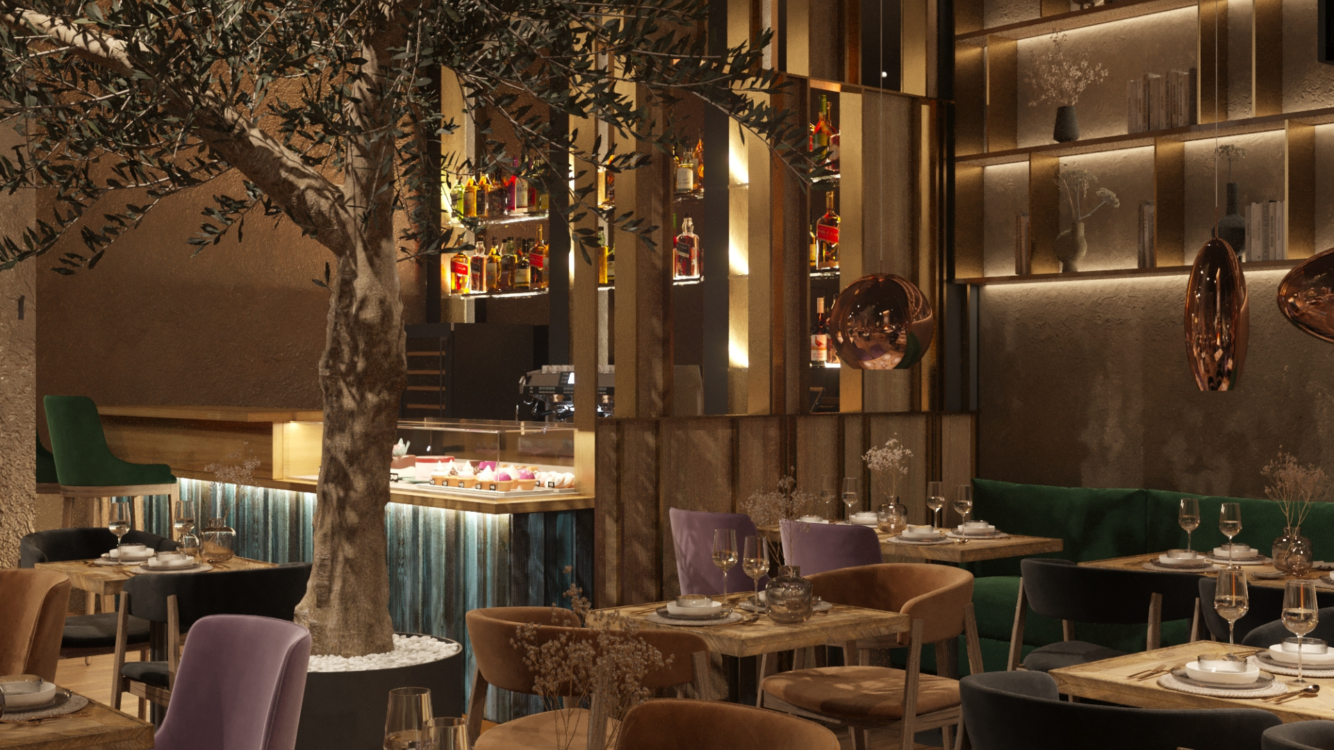
Here are the complex and interesting shades we chose for the design of a Kyiv restaurant: against beige walls and a dark gray ceiling that contrastingly emphasize each other, the emotional uplift of the composition is added by the harmonious inclusion of emerald green, dusty pink, and azure blue, which look very natural.
Another example is the design of an apartment, in which we chose a fairly large color palette to saturate it with emotions while maintaining the design principle that reminds us of our connection with nature.
Now let’s talk about the states and feelings that certain colors can evoke. Scientific research on color psychology has emerged relatively recently, but people have long been interested in the nature and impact of color. In ancient cultures, colors were often used to treat various conditions and influence emotions.
A 2020 study that looked at the emotional associations of 4598 people from 30 different countries showed that people generally associate certain colors with certain emotions. For example, according to the results of this study, 51% of respondents associate black with sadness, 35% associate blue with a sense of relief, 52% believe that yellow signifies joy, 36% associate brown with disgust, 68% associate red with love, and 39% associate green with satisfaction.
The researchers speculated that these results indicate that color and emotion associations probably have universal qualities. However, it is important to always consider that attitudes towards color are often deeply personal and rooted in one’s own experience or culture. For example, while white is used in many Western countries to denote purity and innocence, in Eastern countries it is considered a symbol of mourning.
Therefore, it is necessary to balance between universally accepted psychological properties of color and individual experience and the personal preferences of the client. And the balance between these two aspects should be different depending on the field of design: for example, in residential interiors, it is better to rely more on individual needs, while in commercial premises that are visited by a large number of different people, it is better to consider more the general effects of color.
