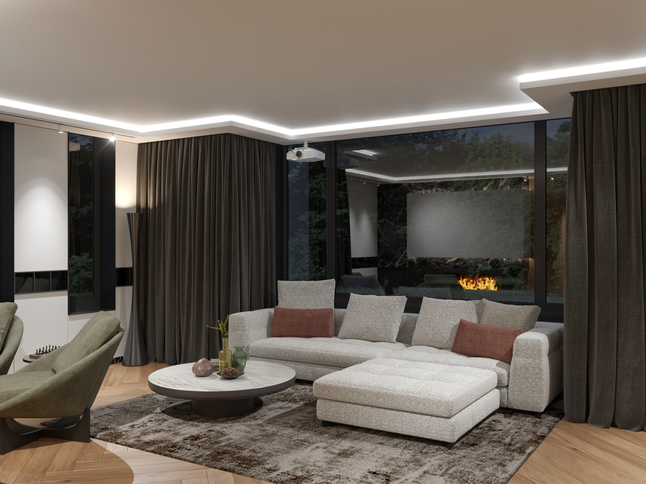
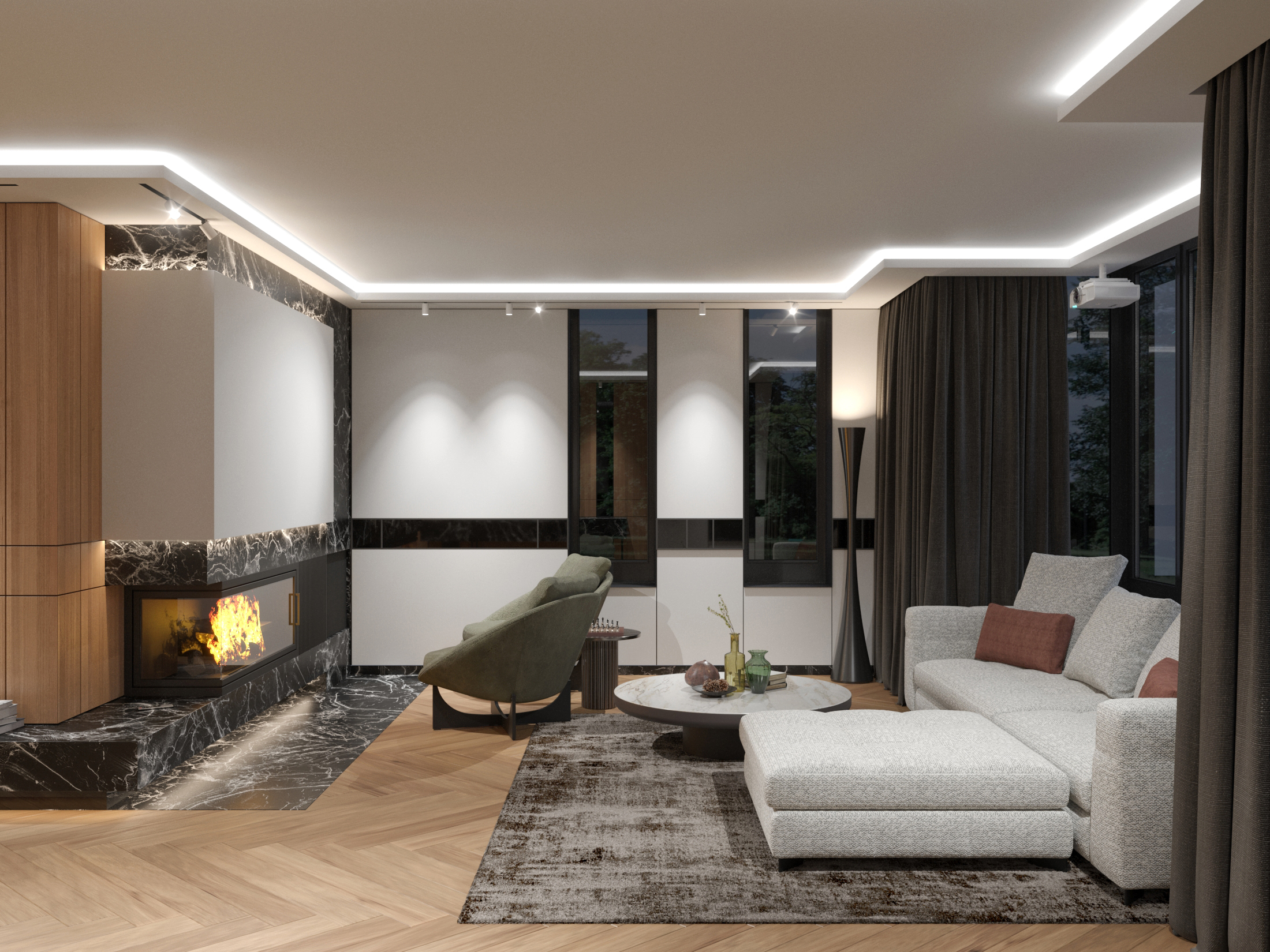
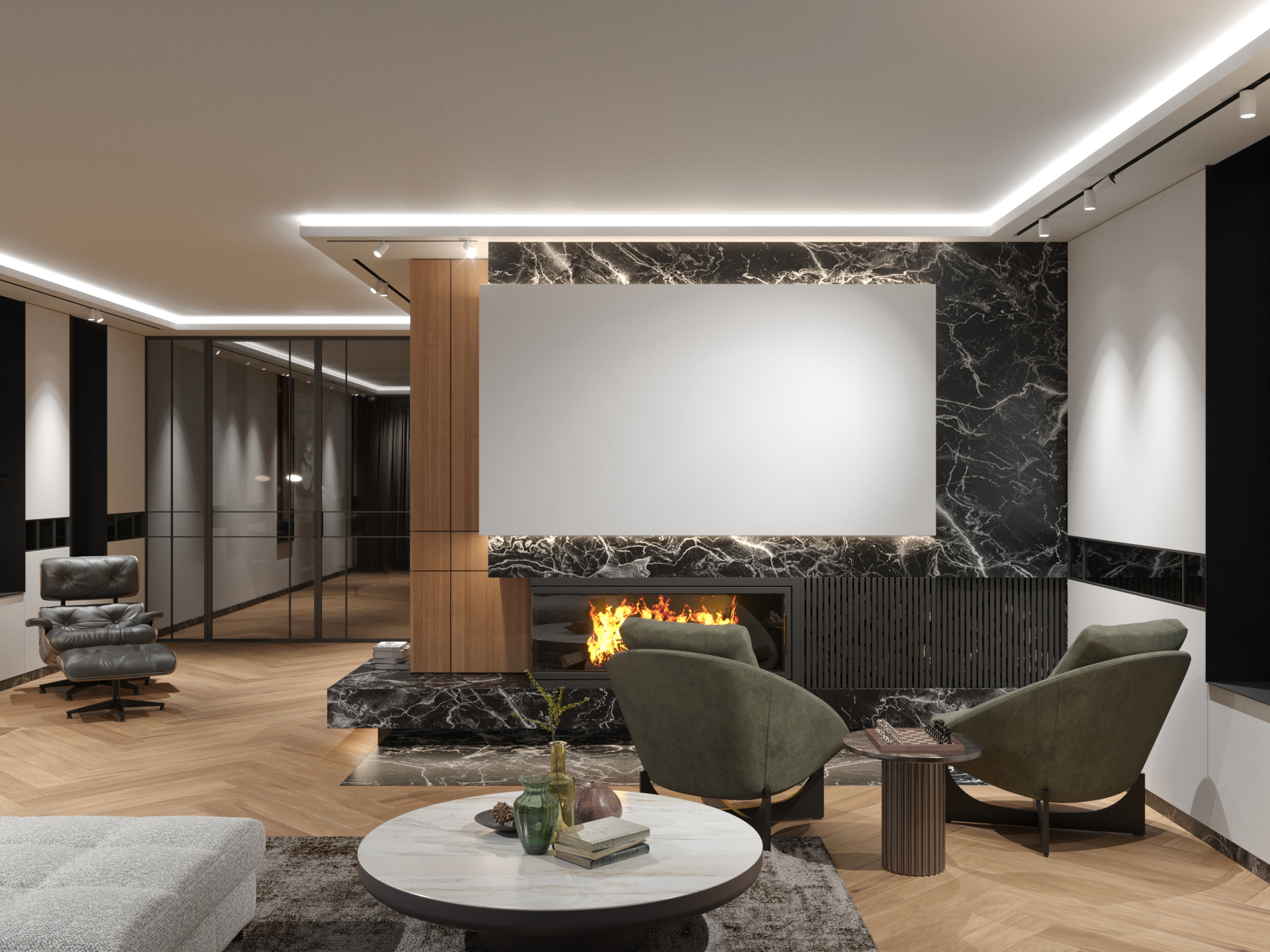
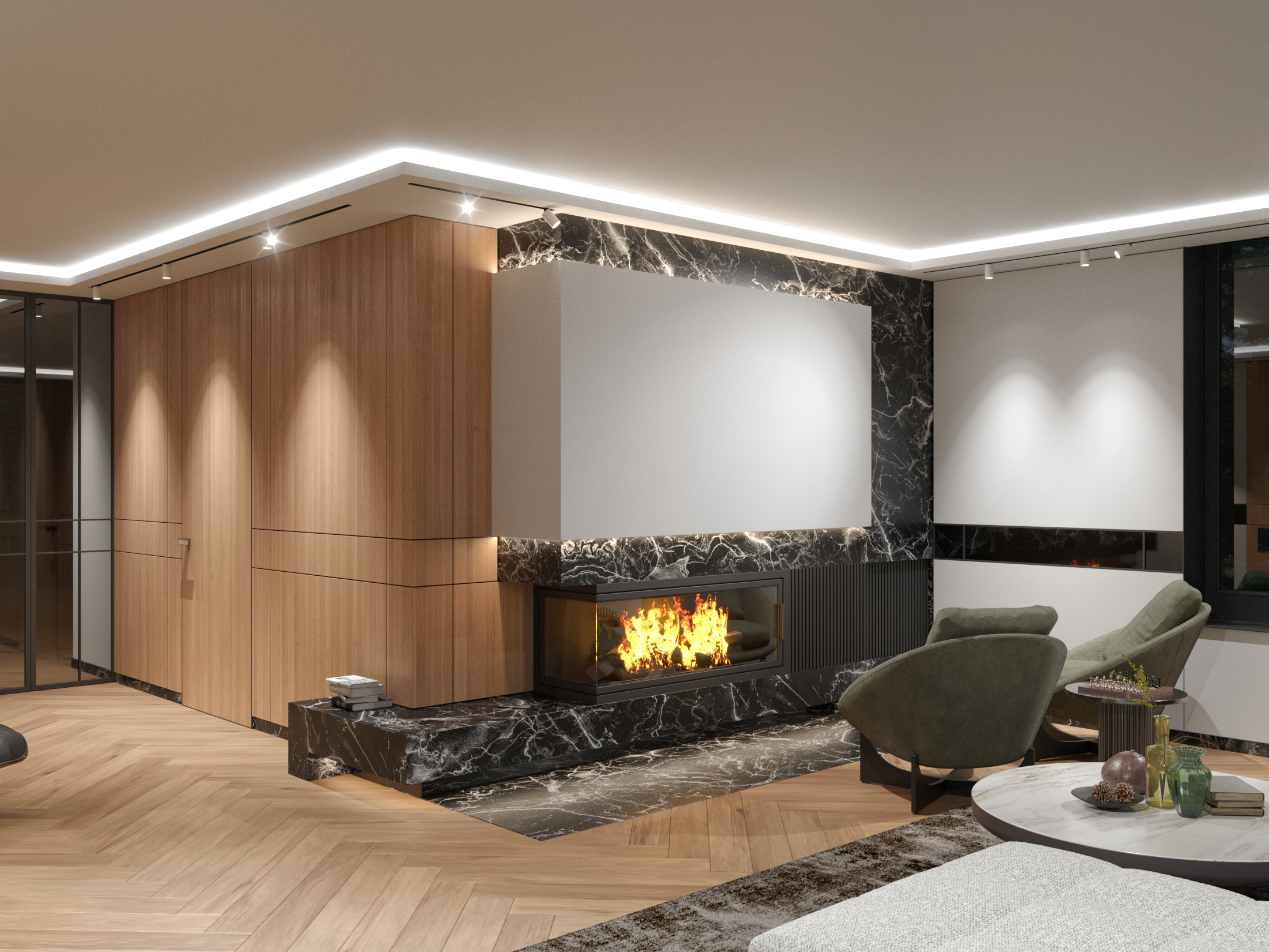
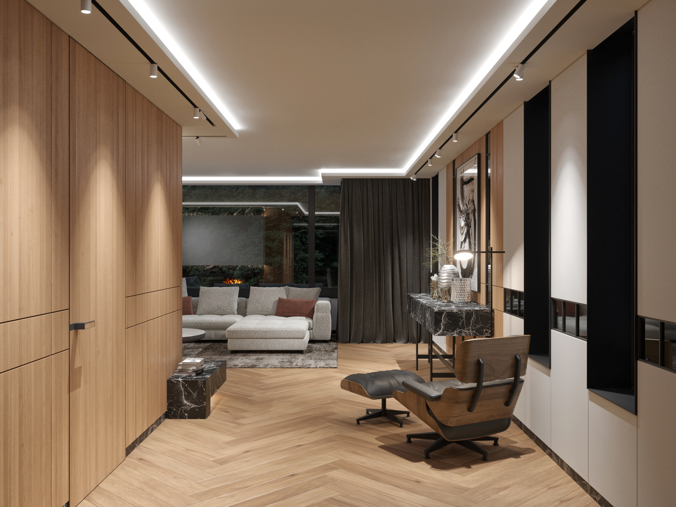
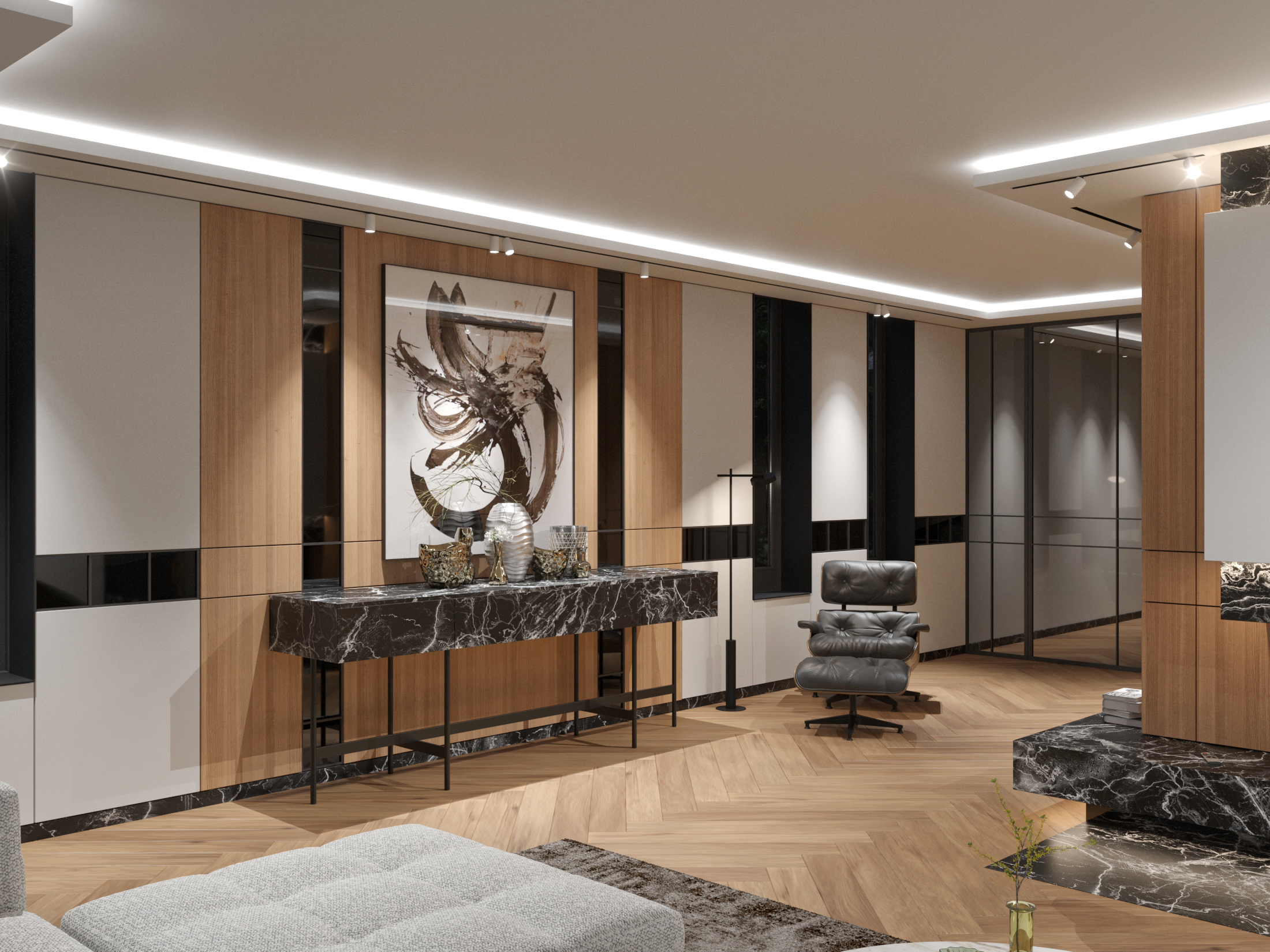
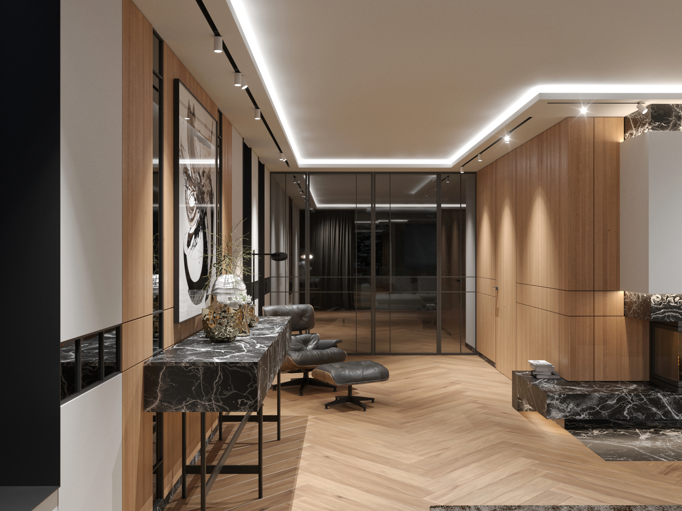
When we updated the interior design for an apartment in Amsterdam, we aimed to create a modern blend of two styles — Scandinavian and Japanese, while also combining minimalism with graphic accent details. The first challenge we faced was the relatively low ceiling (2.55 m), so we had to find ways to visually raise it to make the space feel cozy. To achieve this, we lowered the ceiling along the perimeter and added hidden lighting, making the central part appear "detached" from the lower section and perceived by the eye as higher than it actually is. The key element of the living room — the fireplace — was slightly shifted to create additional space for wood storage. Above it, we placed a white wall that serves as a screen, with the projector positioned opposite it, allowing the panoramic window to be covered with dark curtains to set up a home theater. In the interior, we predominantly used white and light wood on the walls and floors — characteristic features of the Scandinavian style. Meanwhile, the dark natural stone used for the furniture and fireplace, black glass inserts on the walls, and MDF panels on the windows, visually dividing the room into upper and lower parts, reflect the graphic nature of Japanese interiors. This tendency towards structure and "elegant segmentation" is also seen in the lighting through linear magnetic tracking systems. To add color accents, we incorporated green furniture and brown decor into the interior.
- Square 50 m²
- Location Amsterdam, Netherlands
- Team Vadym Ziuziuk, Mariia Matushenko, Yurii Yarmolenko, Serhii Sheremet
