Ibis store on Bazhana Avenue, Kyiv
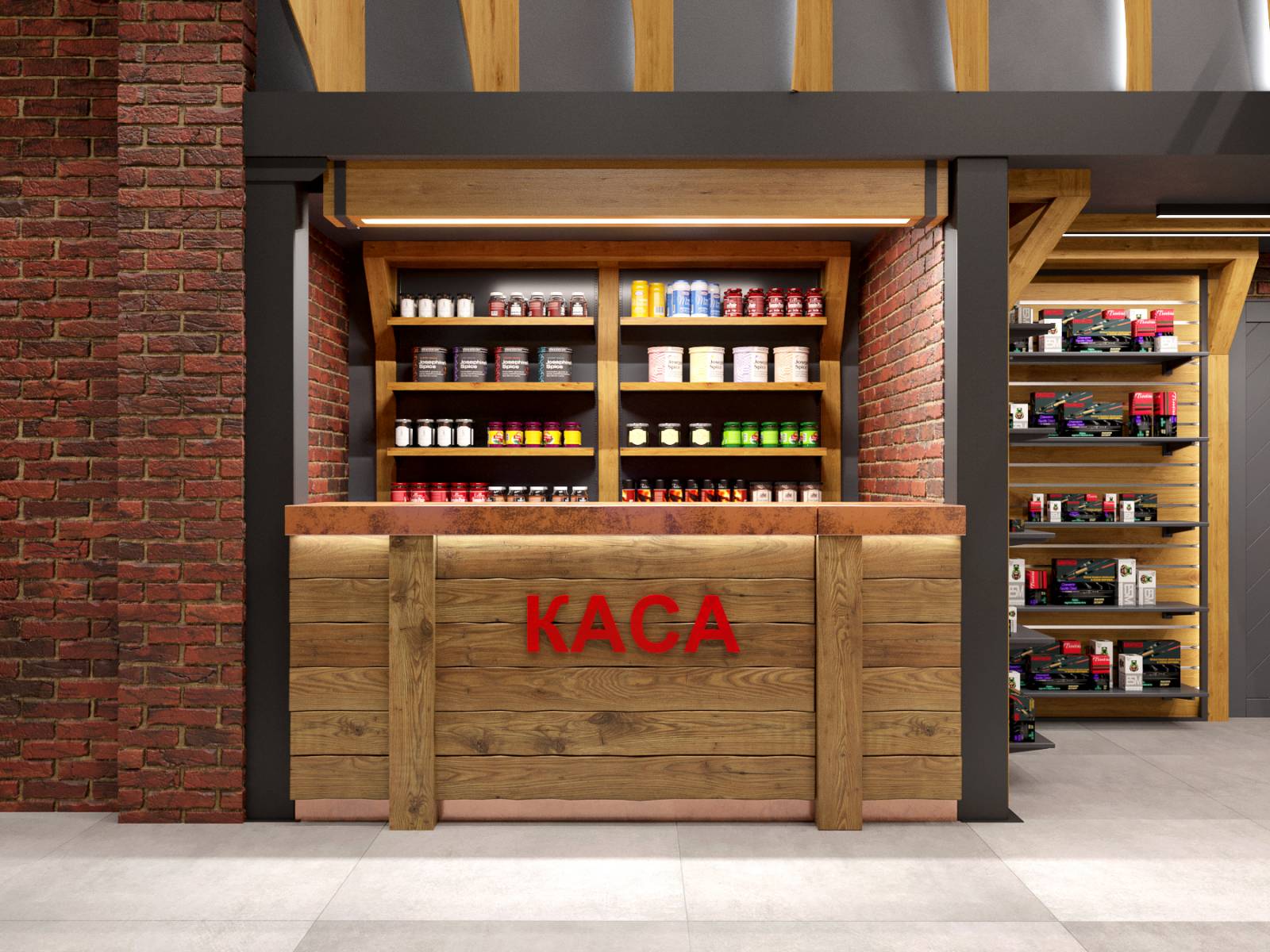
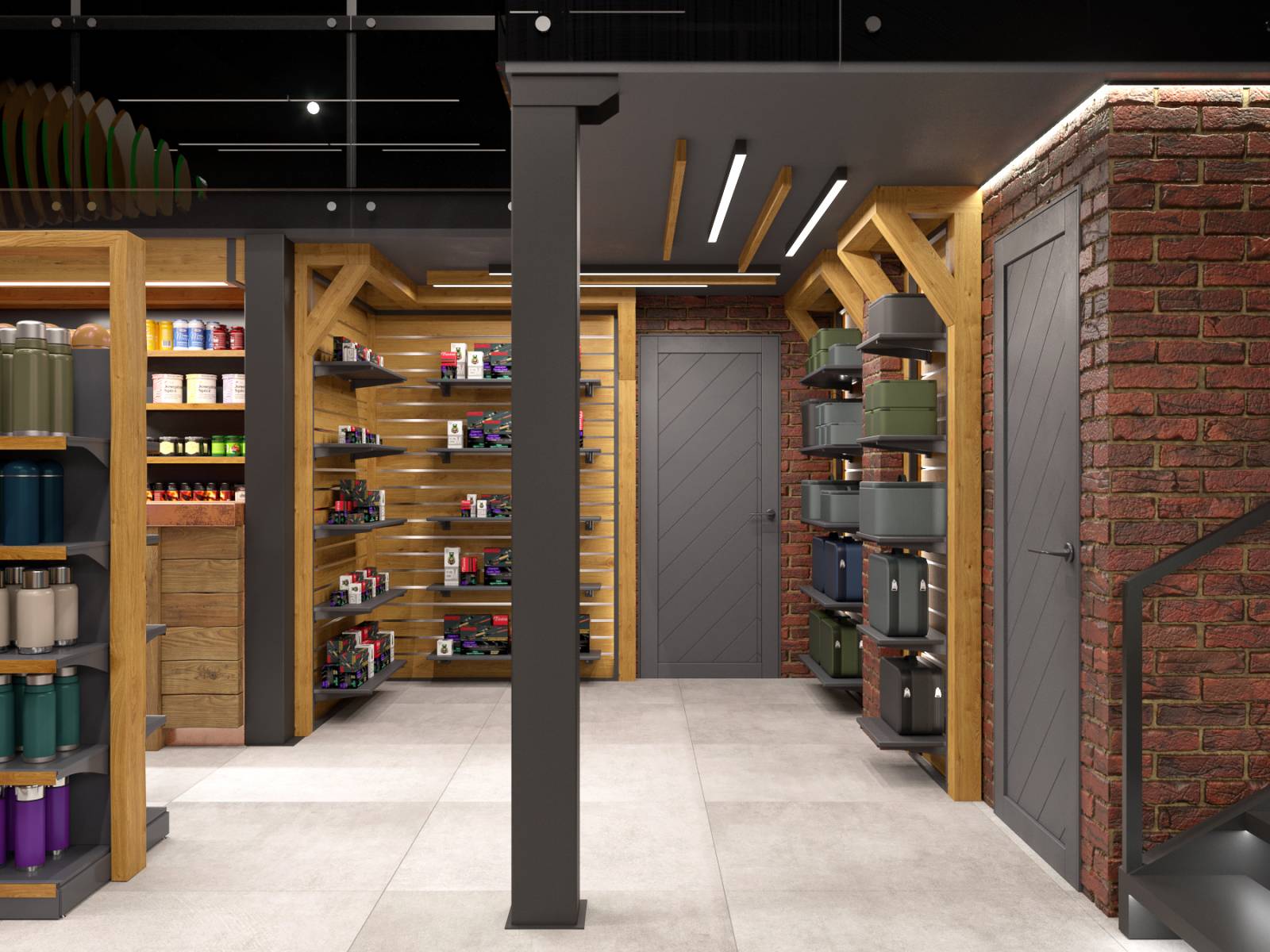
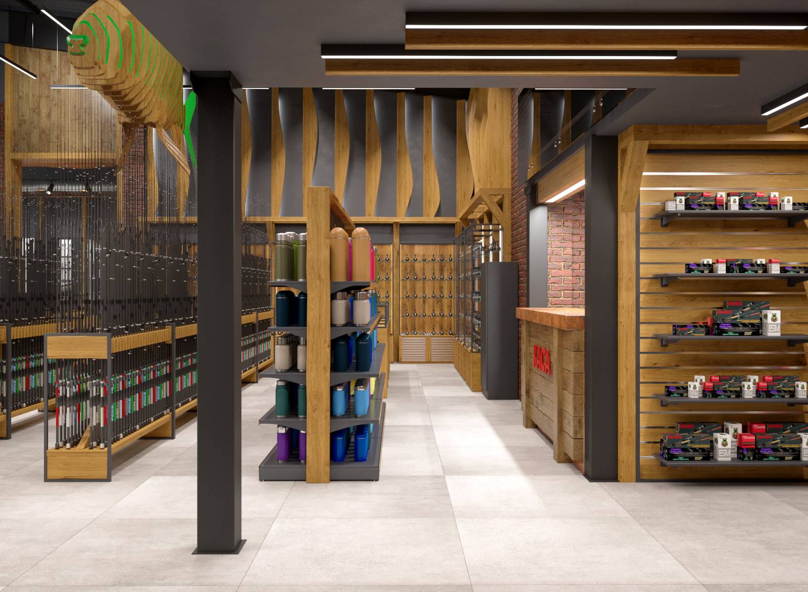
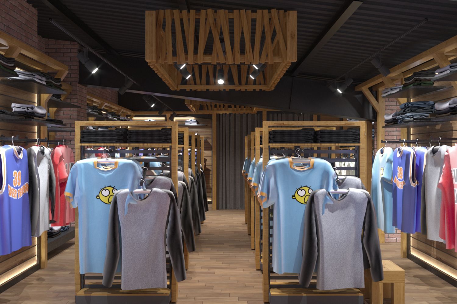
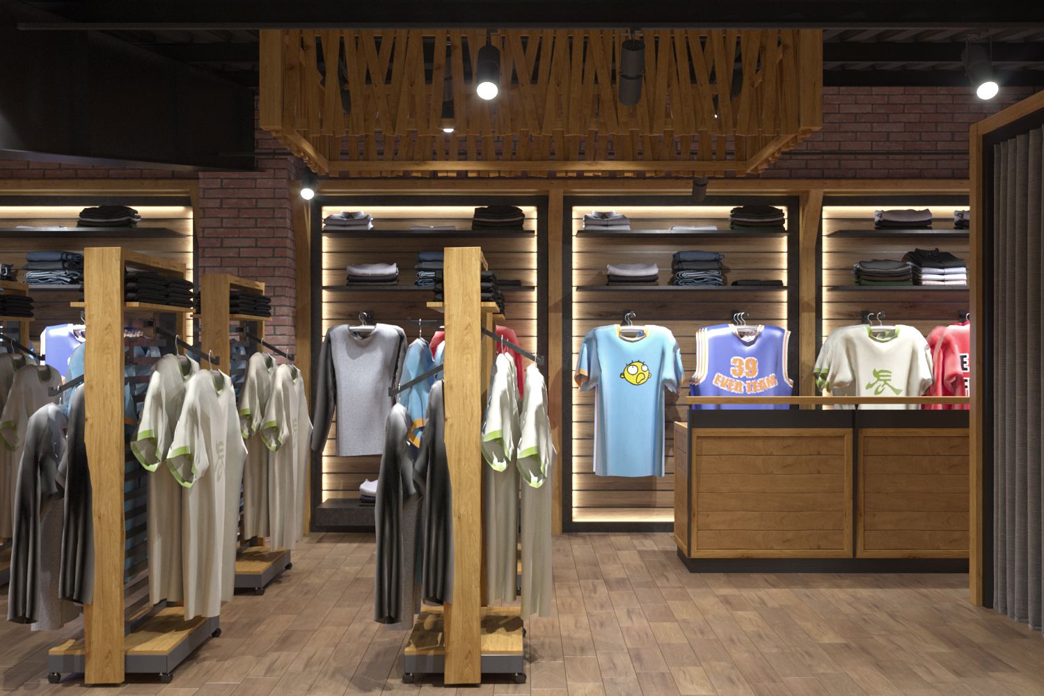
The updated style of Ibis stores combines modern design with the brand's signature country style. This evolution of the store concept became necessary, given that outdoor activities have been added to the store's traditional hunting and fishing areas.
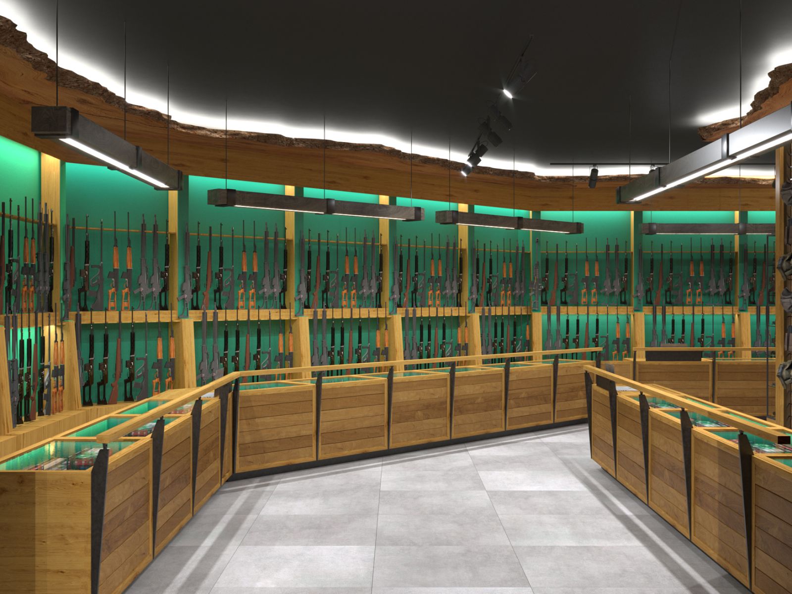
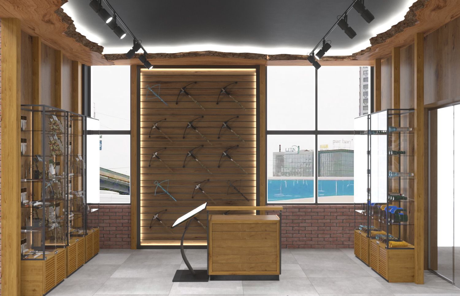
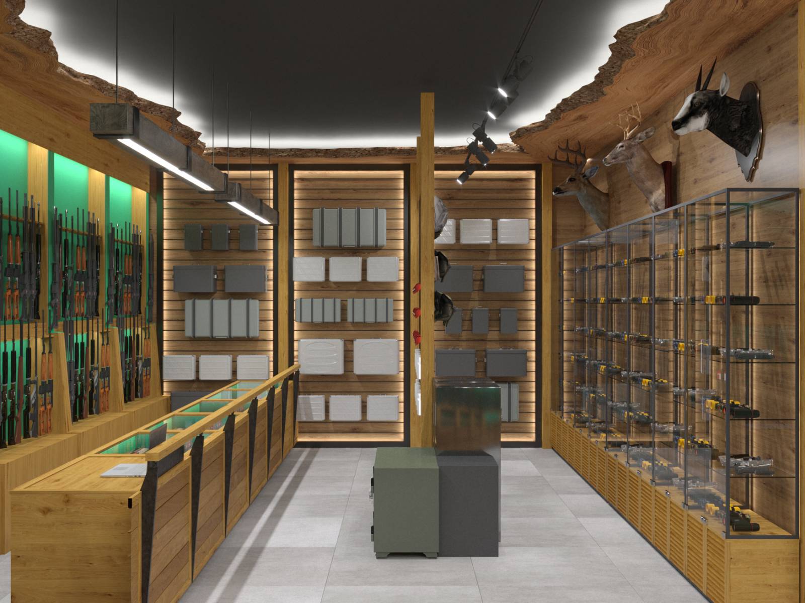
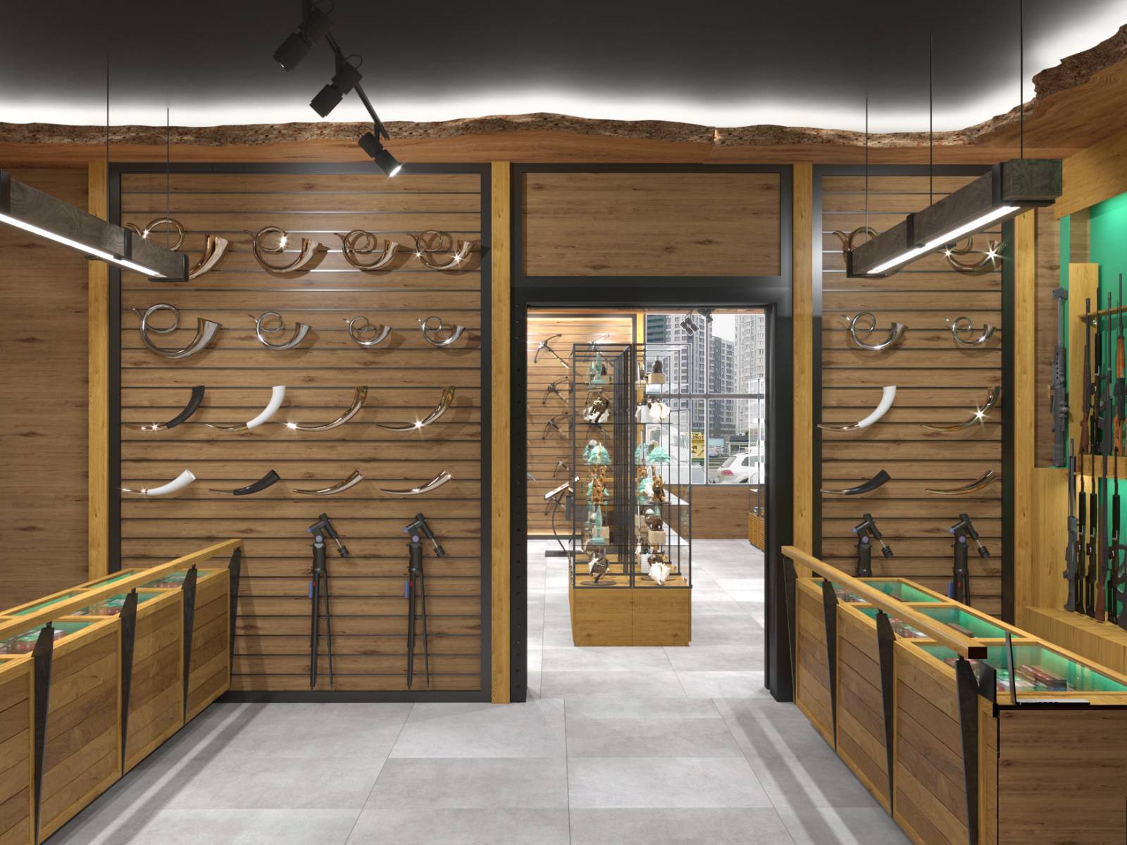
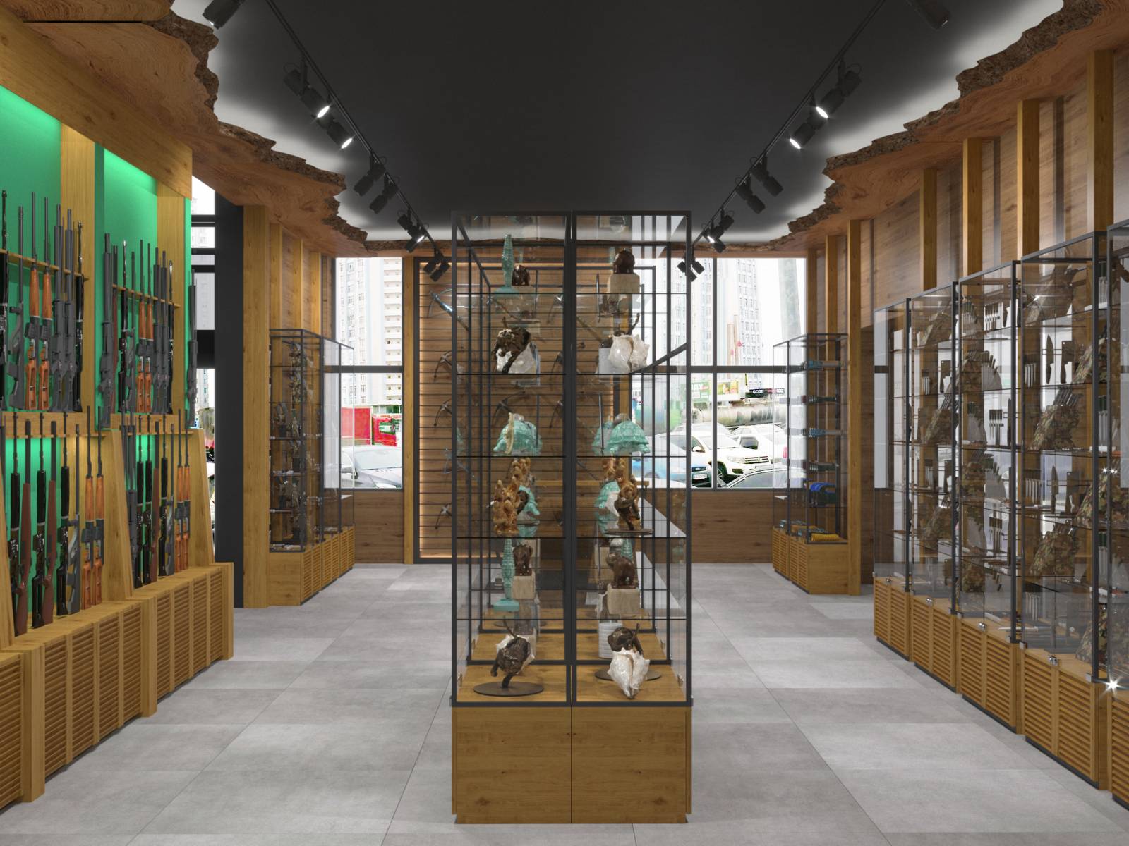
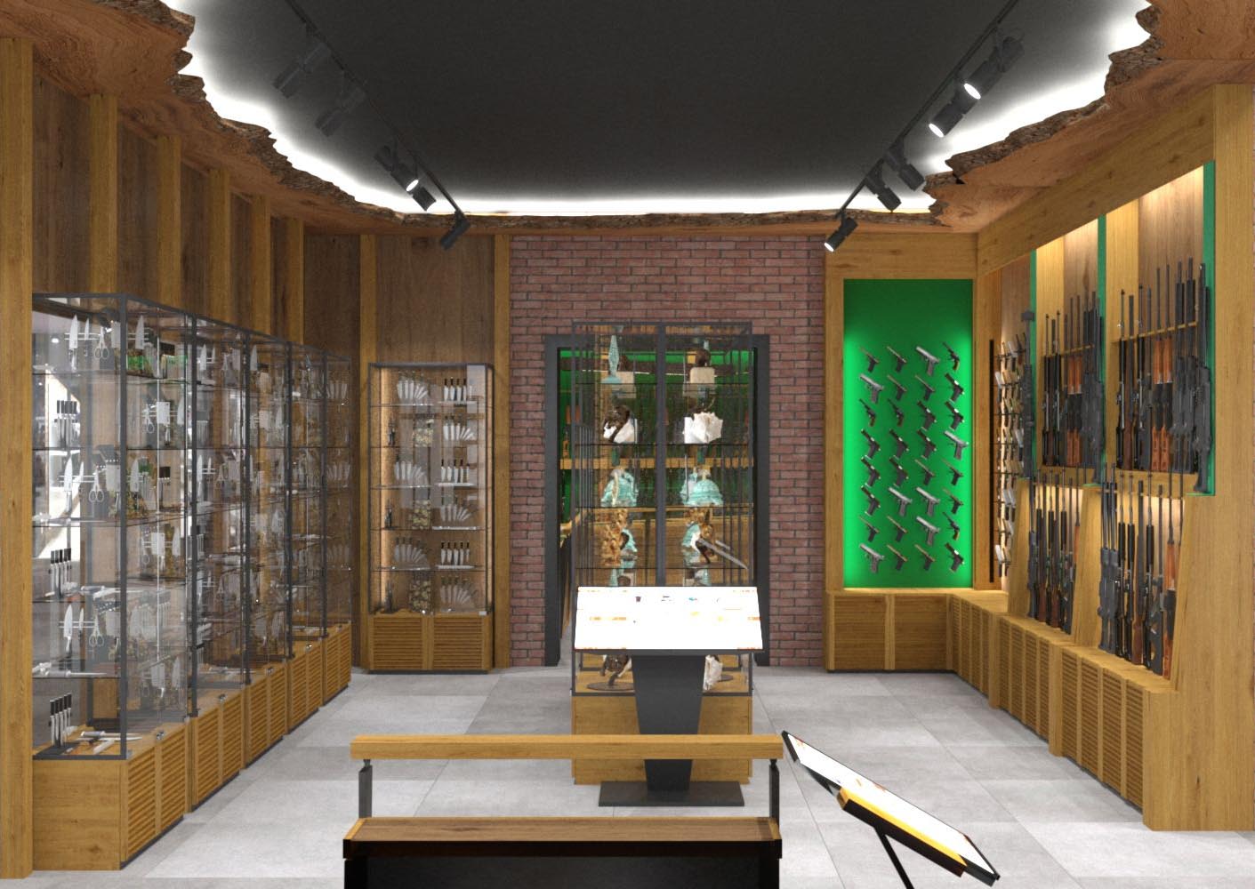
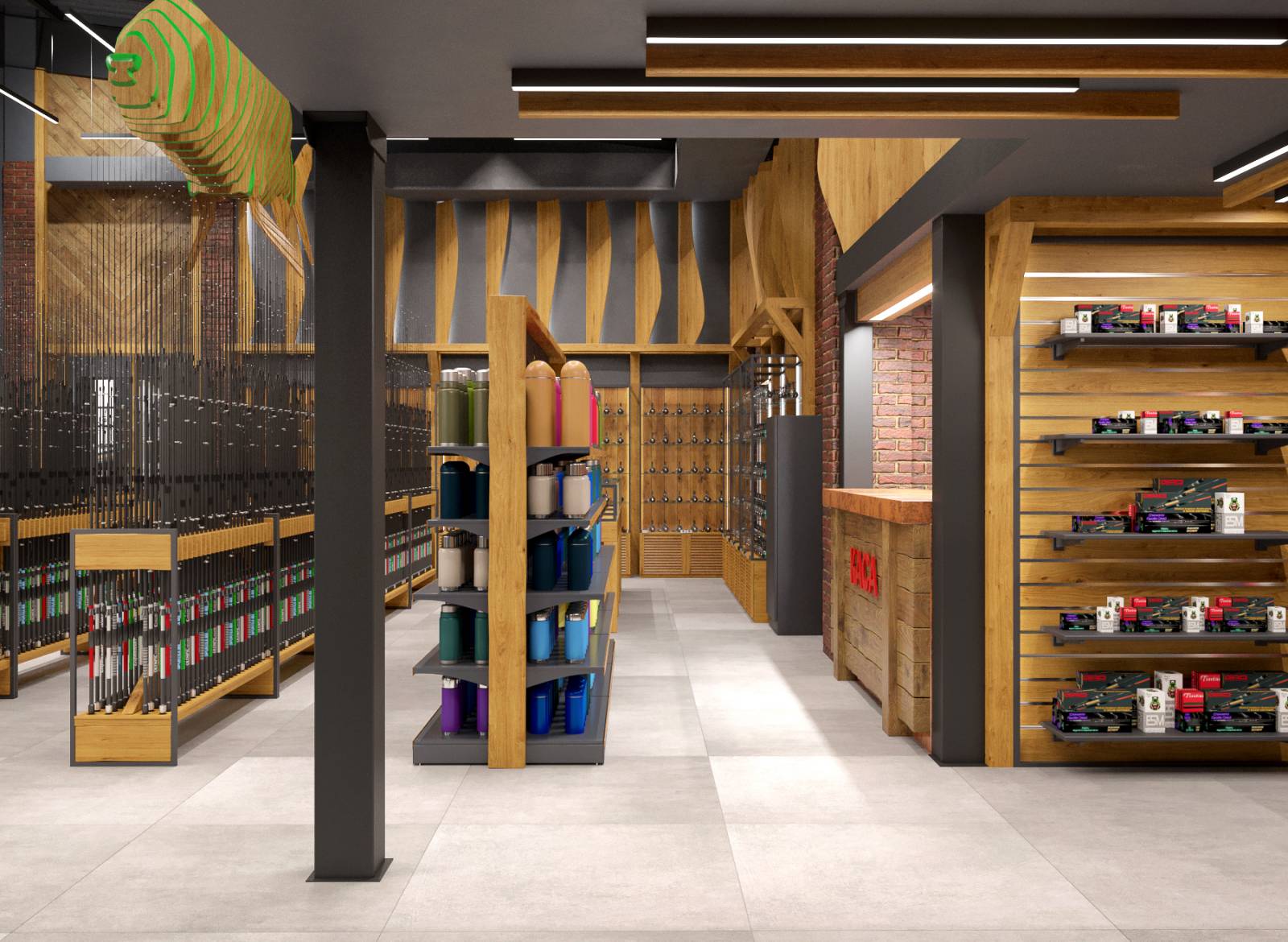
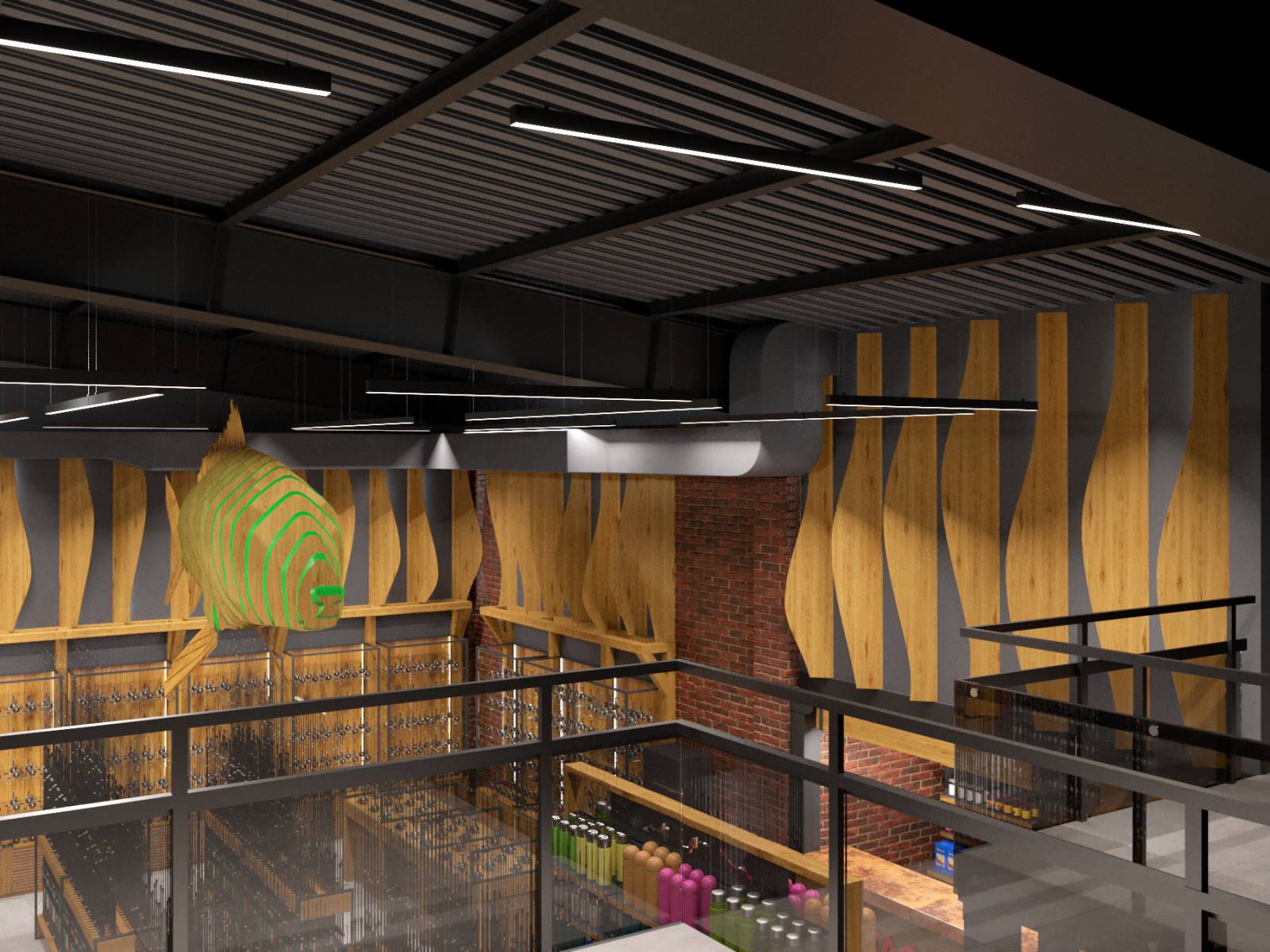
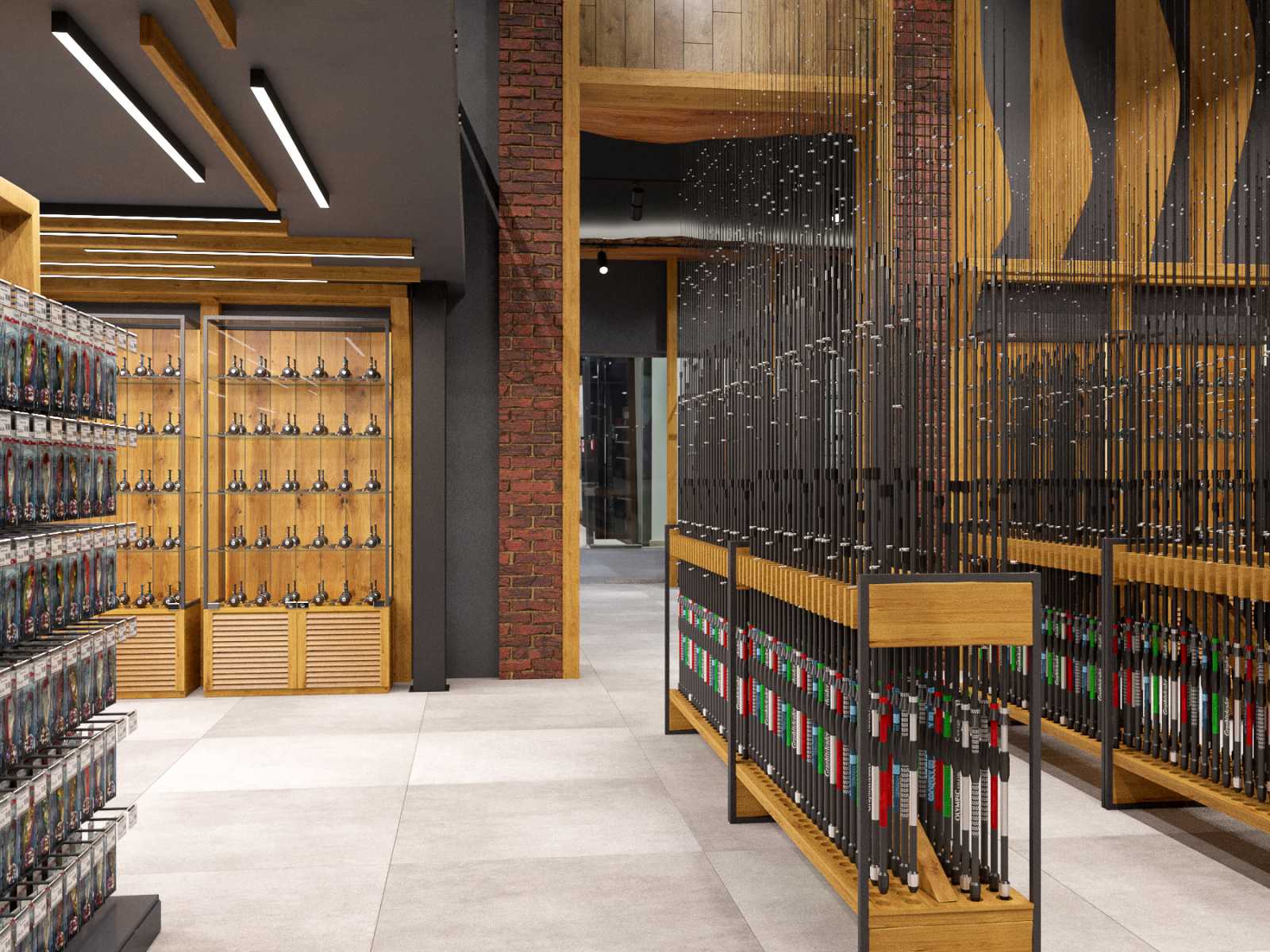
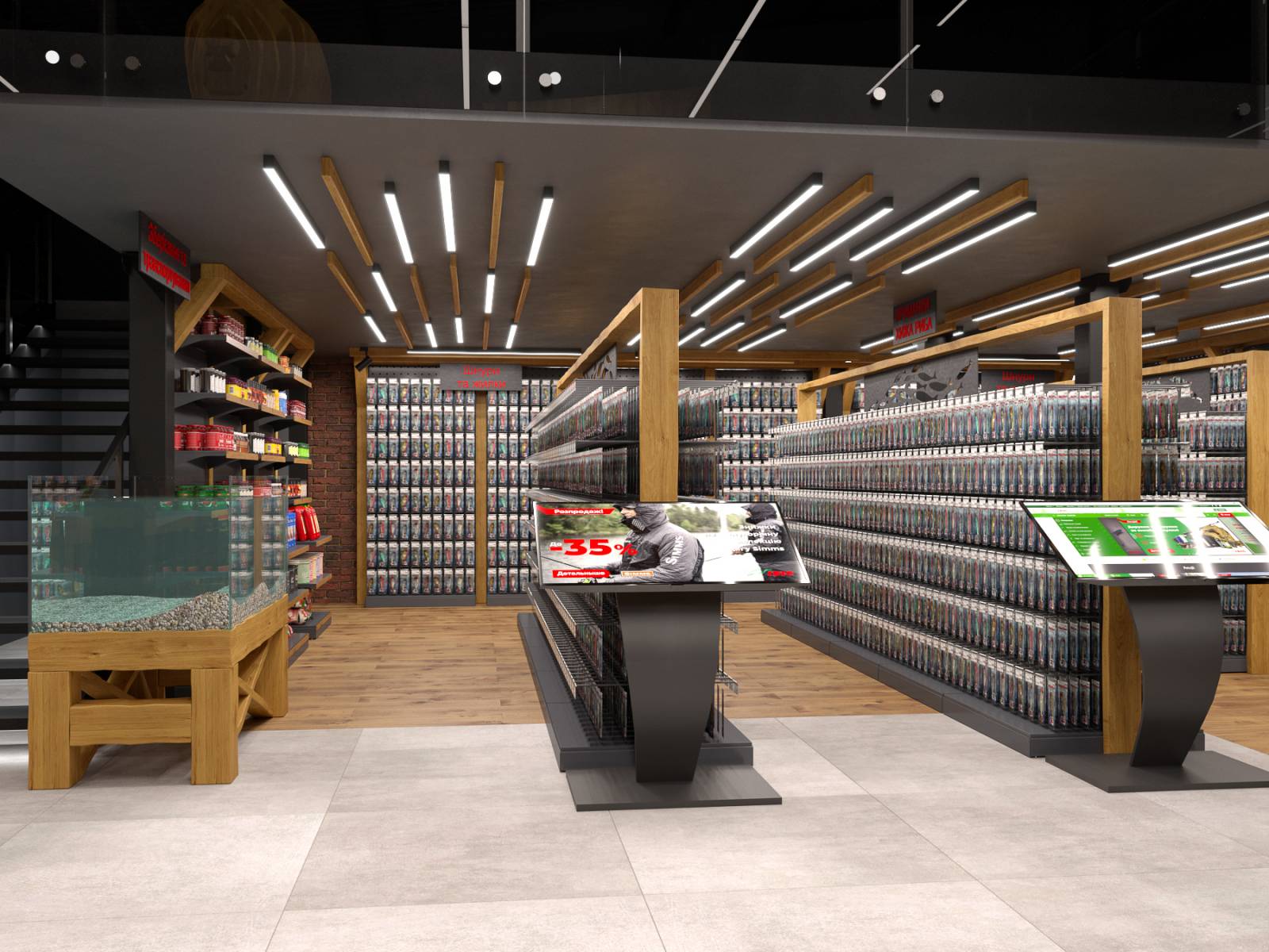
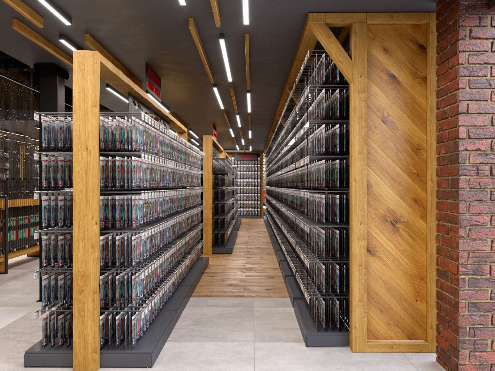
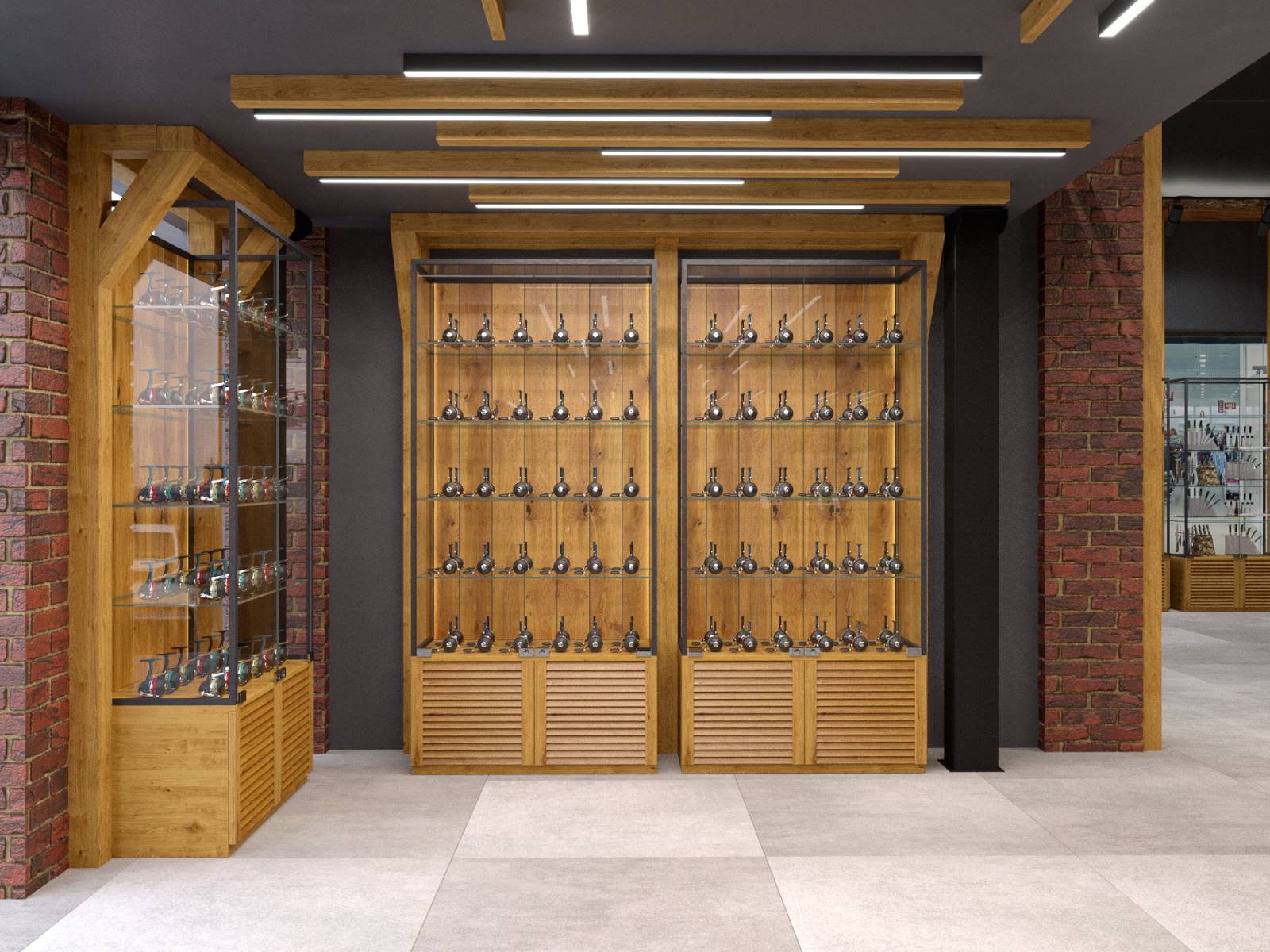
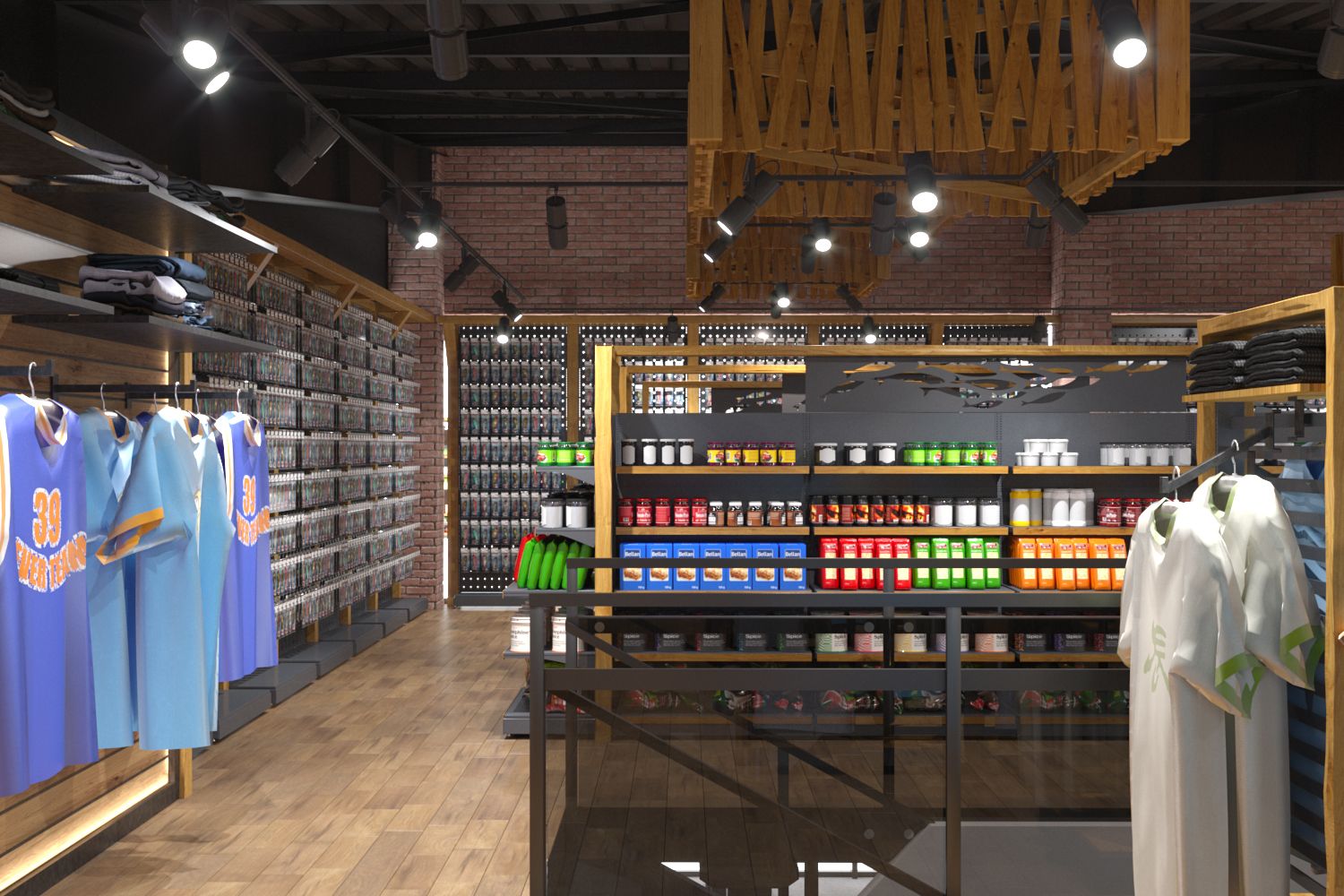
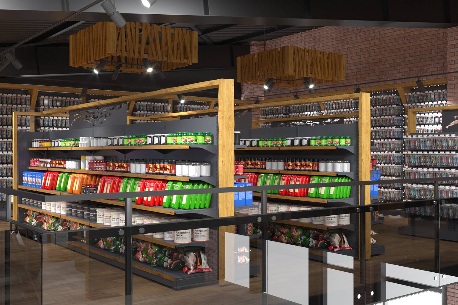
We kept wood and the atmosphere of an old country house that it creates as a key design element. The unedged boards above the gun cabinets stand out especially: as a decorative element that adds natural pristine to the space, and as a functional one for the effect of raising the ceiling, which works in combination with gray and lighting. The wood successfully contrasts with the gray colour, which serves as a beautiful background without distracting attention from the accent details of the interior, and also helps to hide the engineering communications on the ceiling.
We didn't change the design of the gun cabinets with a green background, which is a classic for Ibis stores. Instead, we developed metal handrail holders in front of the horizontal display cases that resemble weapons, which allowed us to tie the composition into a single whole.
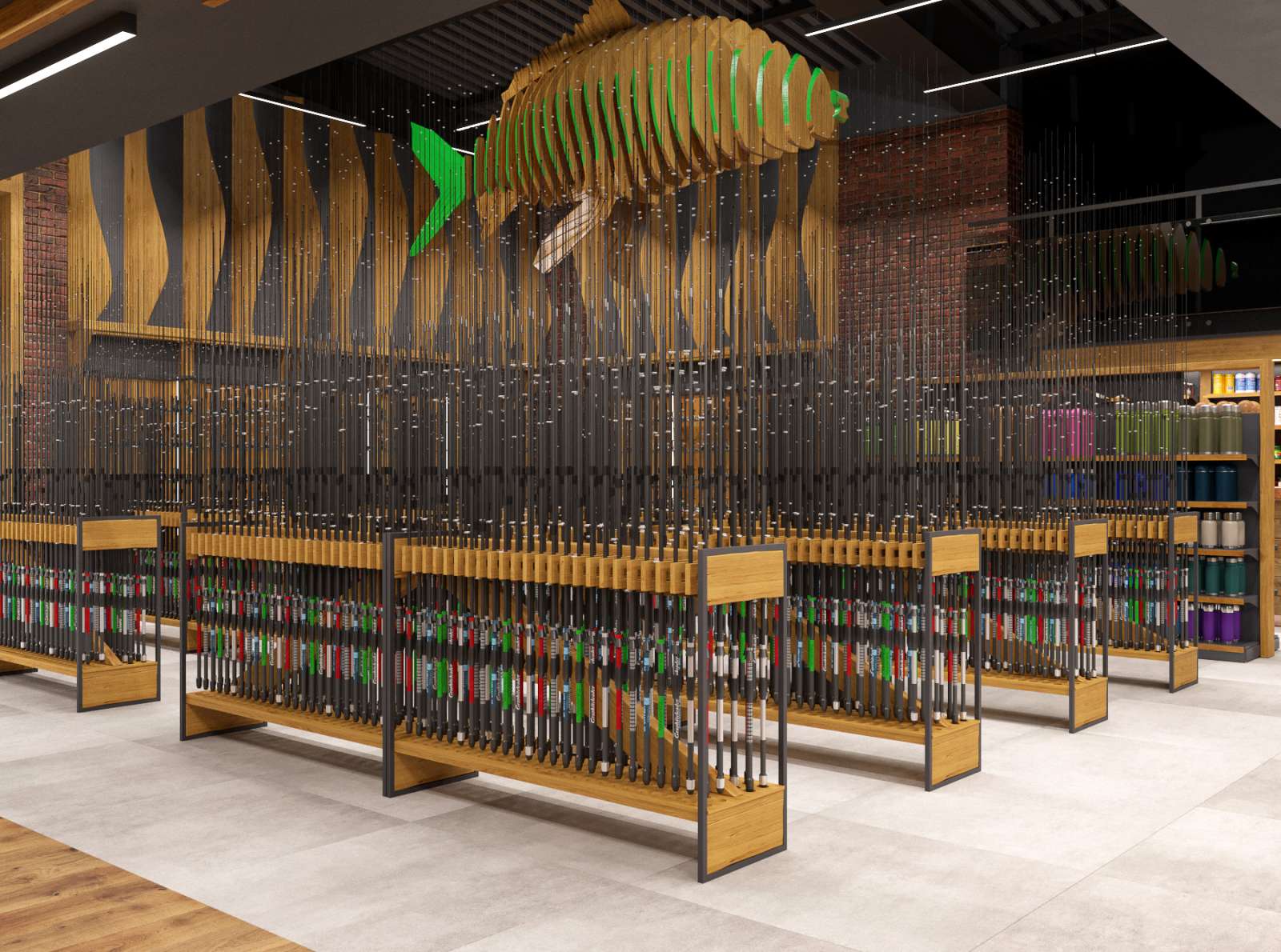
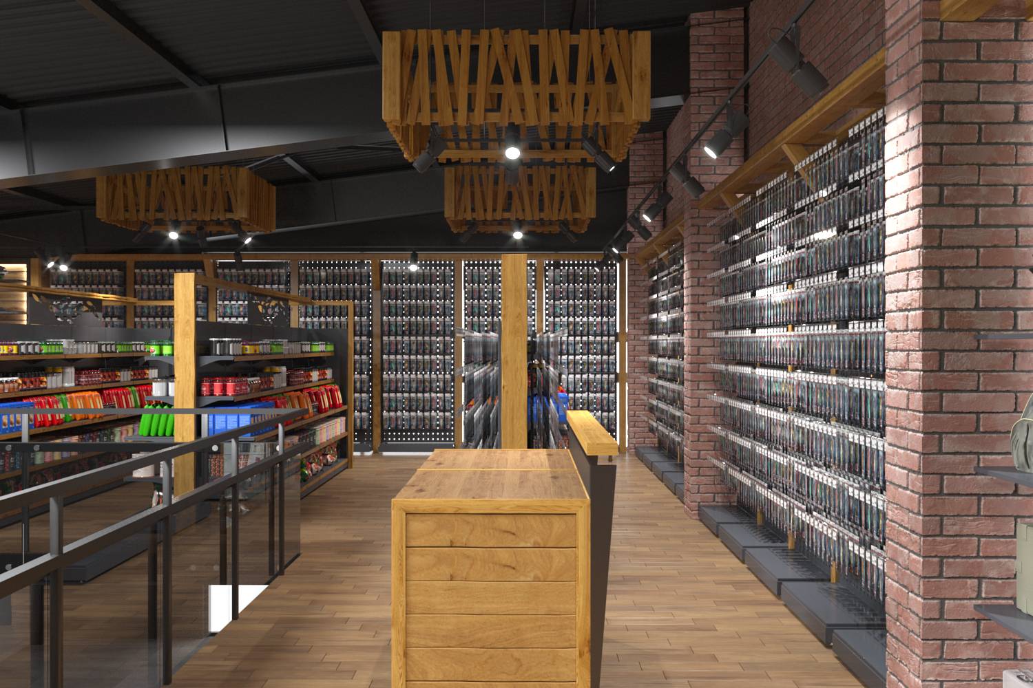
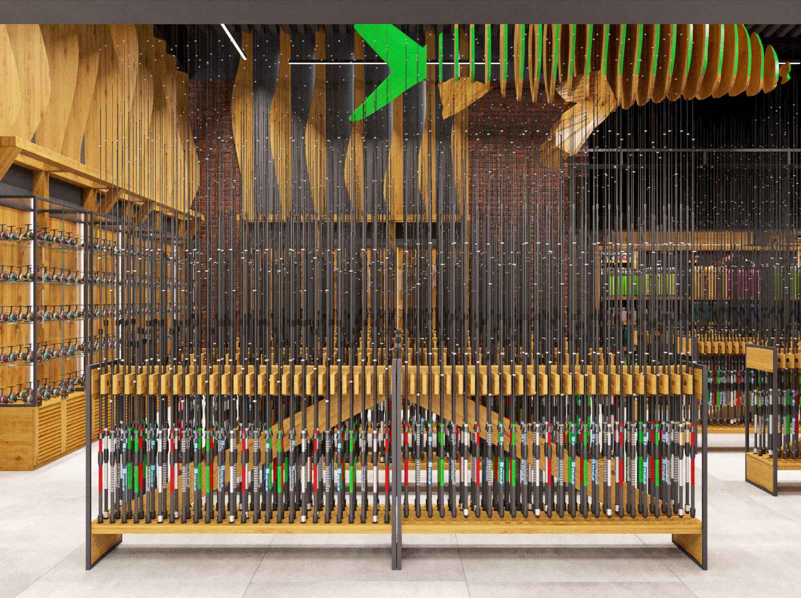
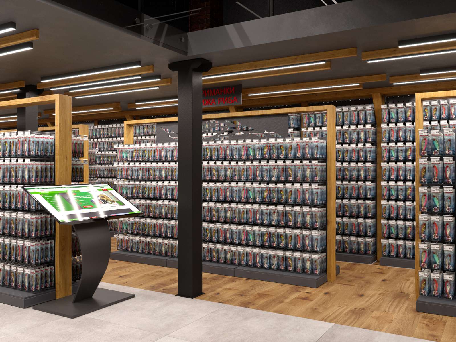
We created the image of water in the fisheries department with the help of wooden waves on the walls and a three-dimensional installation of fish, also made of wood. The vertical arrangement of fishing rods reminds of a bamboo forest and structures the space. We also used different textures of flooring materials to create this structure, separating the product areas from each other, for example, in the fish bait and food department we chose wooden tiles, in the weapons department — tiles with a stone texture.
- Location Kyiv, Ukraine
