Project of the big Ibis store
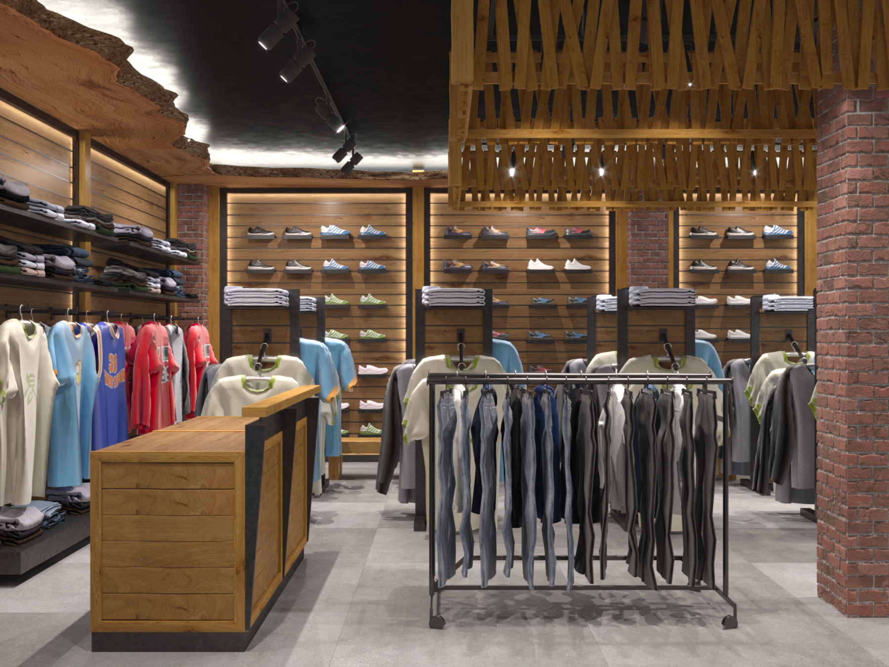
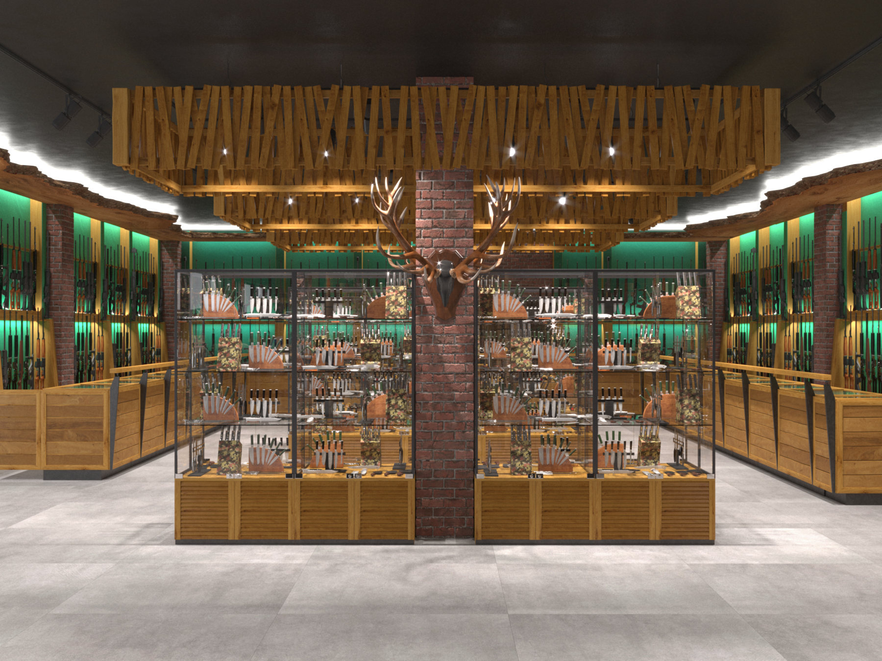
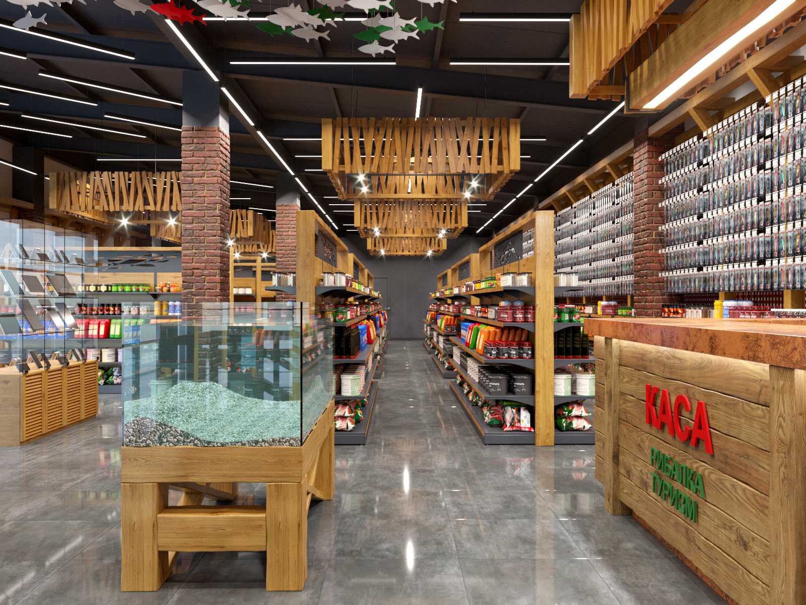
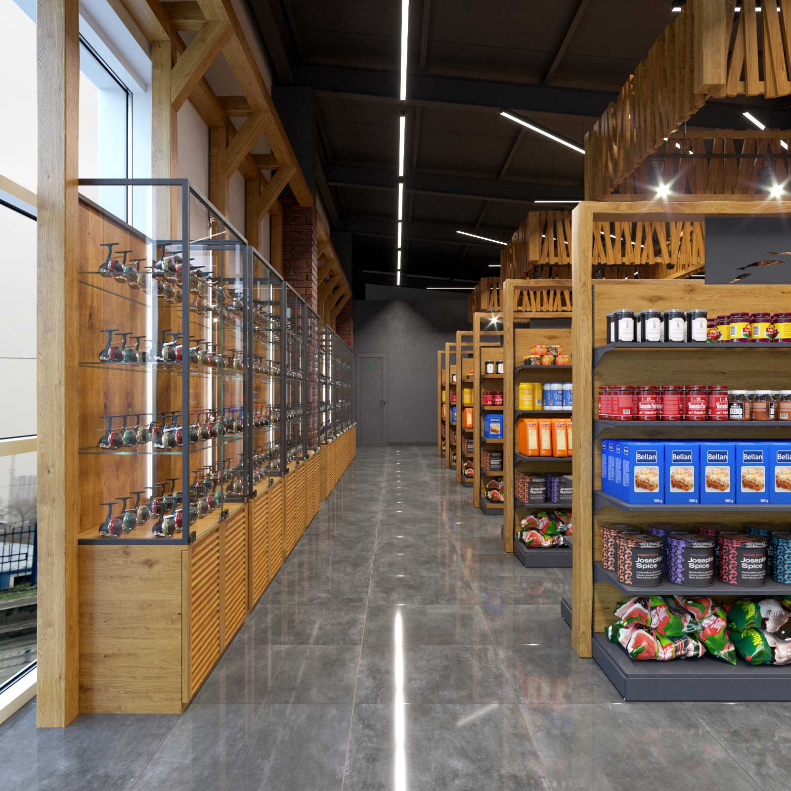
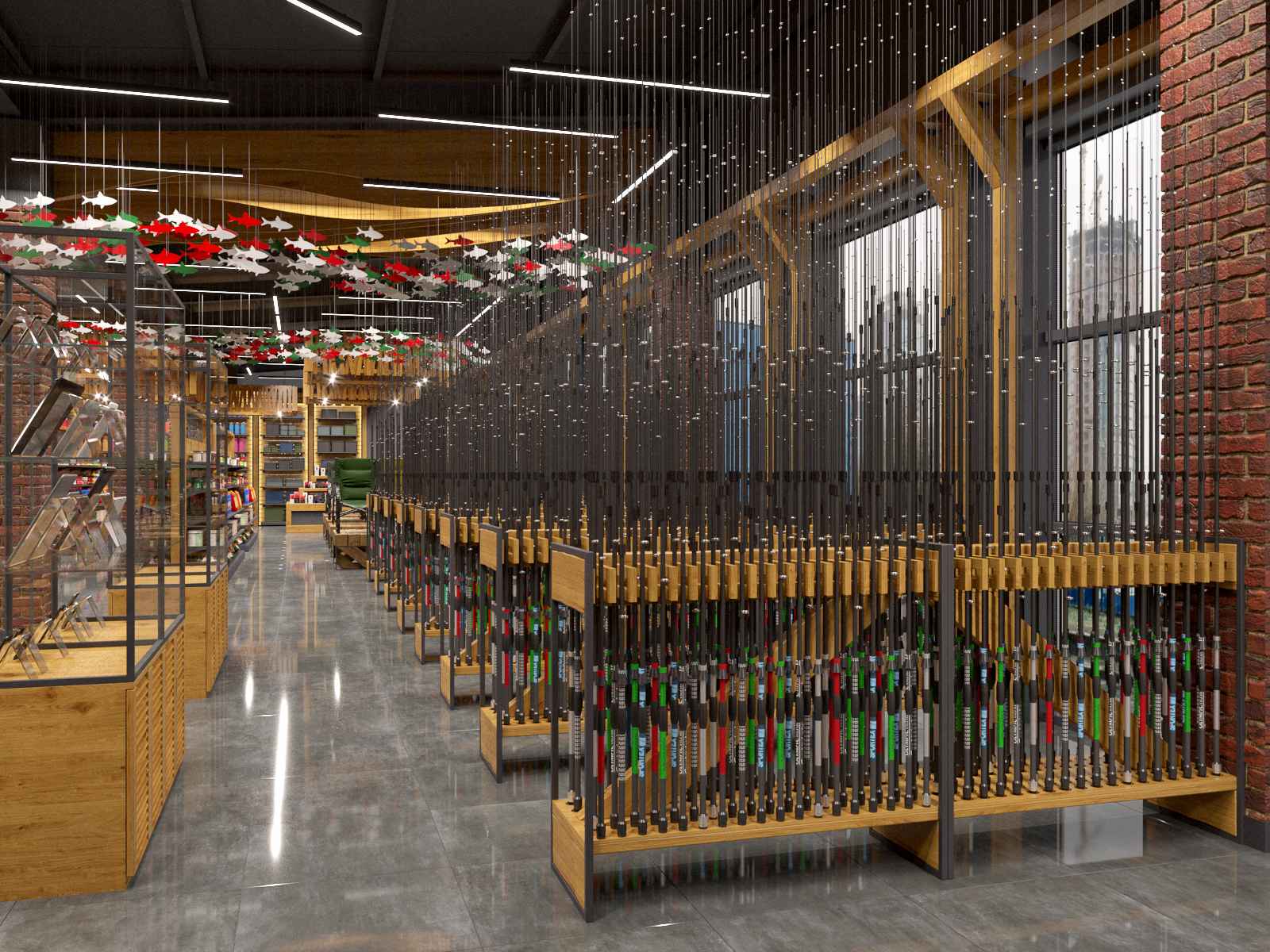
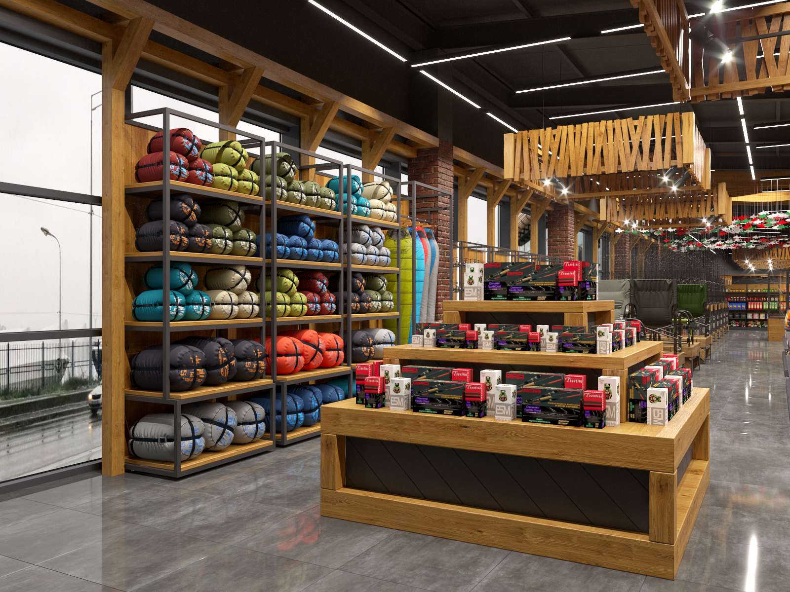
We show our concept for a new sort of Ibis shop, which was never built but served as a prototype for the company's future locations. We have designed a large two-story space, where the first floor is dedicated to weapons and travel goods, and the second to fishing.
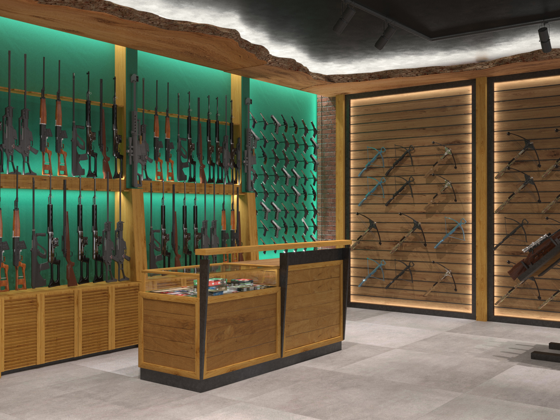
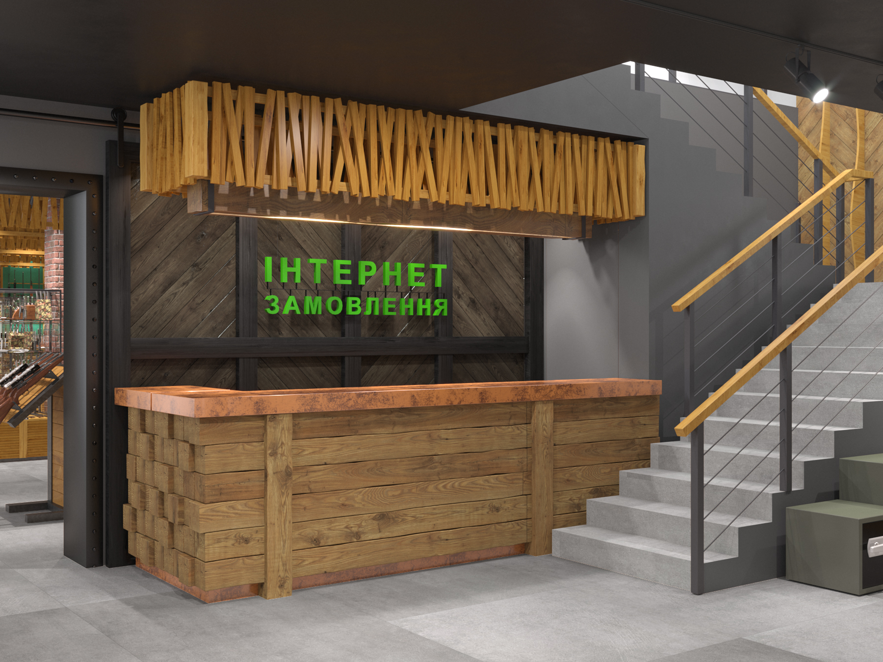
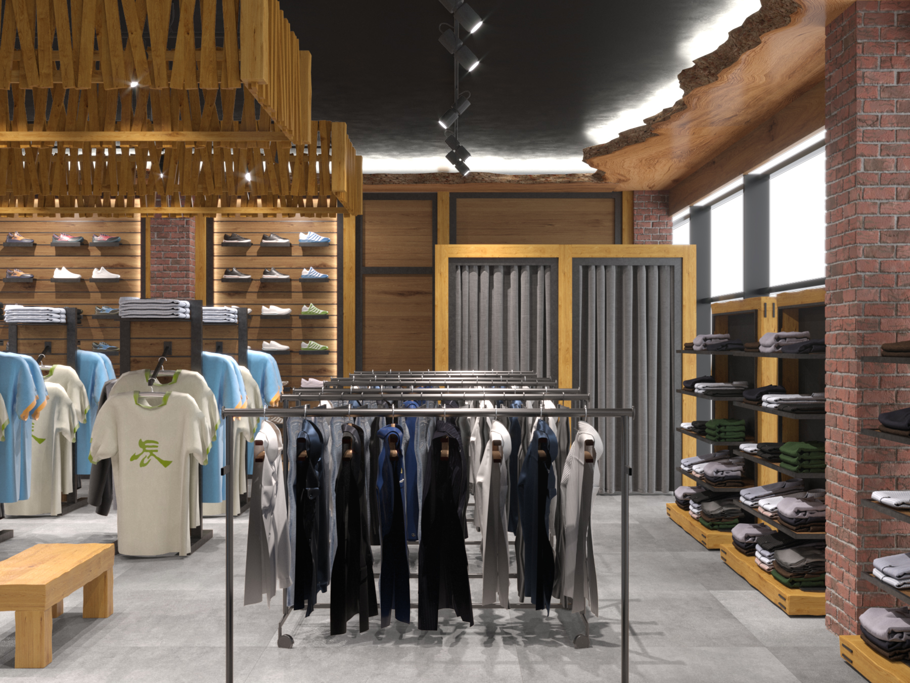
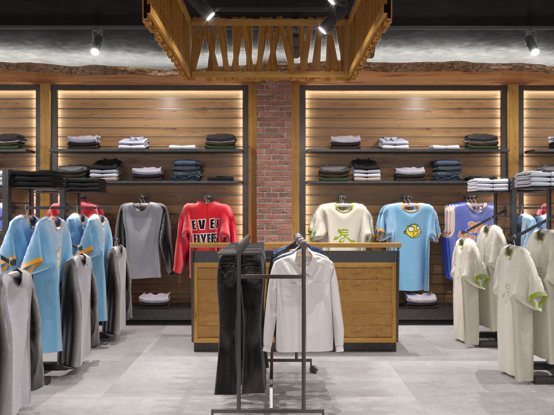
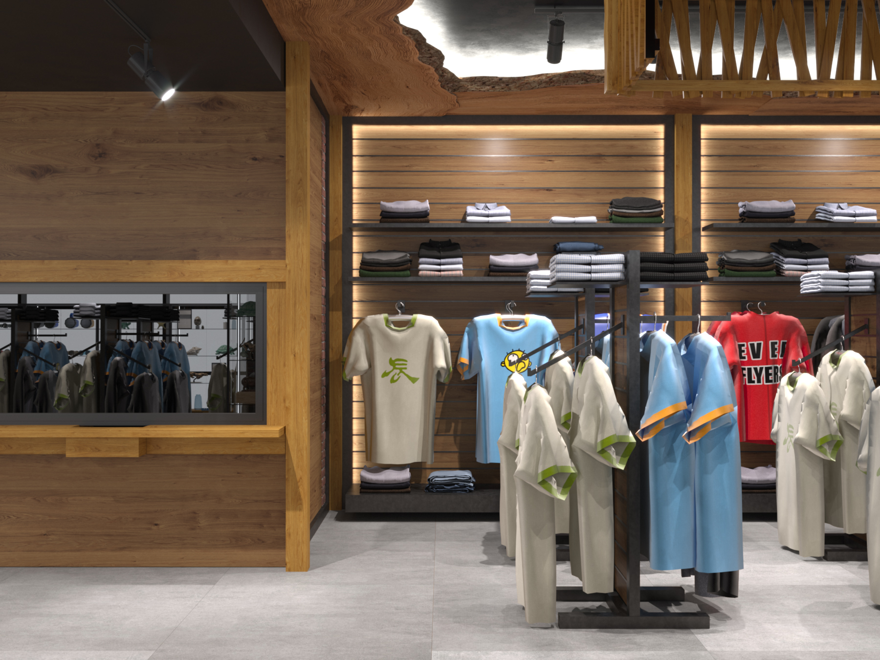
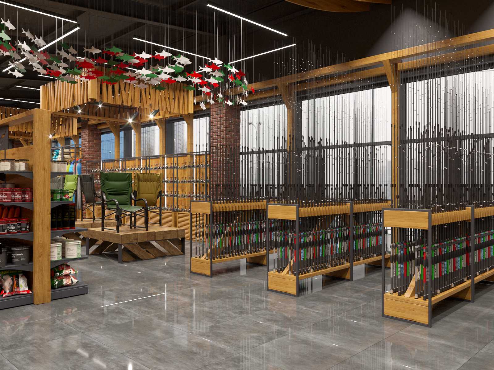
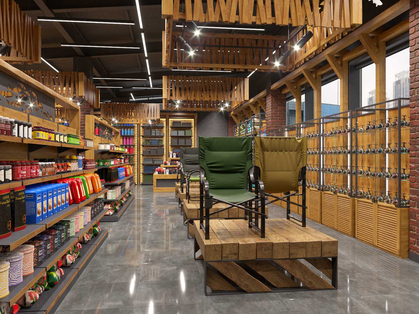
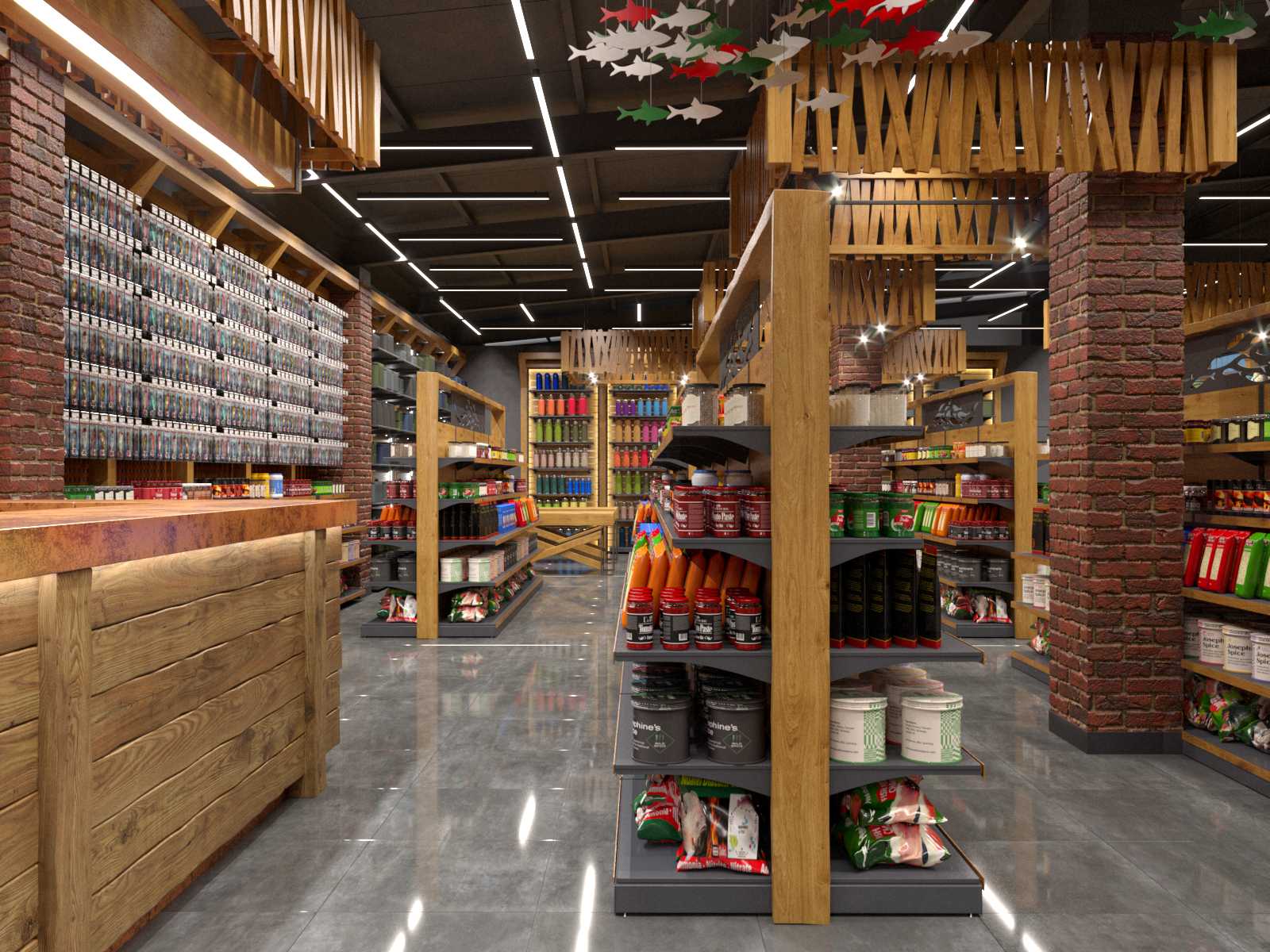
The fundamental value of the project is the customization of all traditional commercial equipment. We created new furniture, display cases, and stands for all product categories, mixing the brand's trademark country aesthetic with aspects of several modern styles, including loft style.
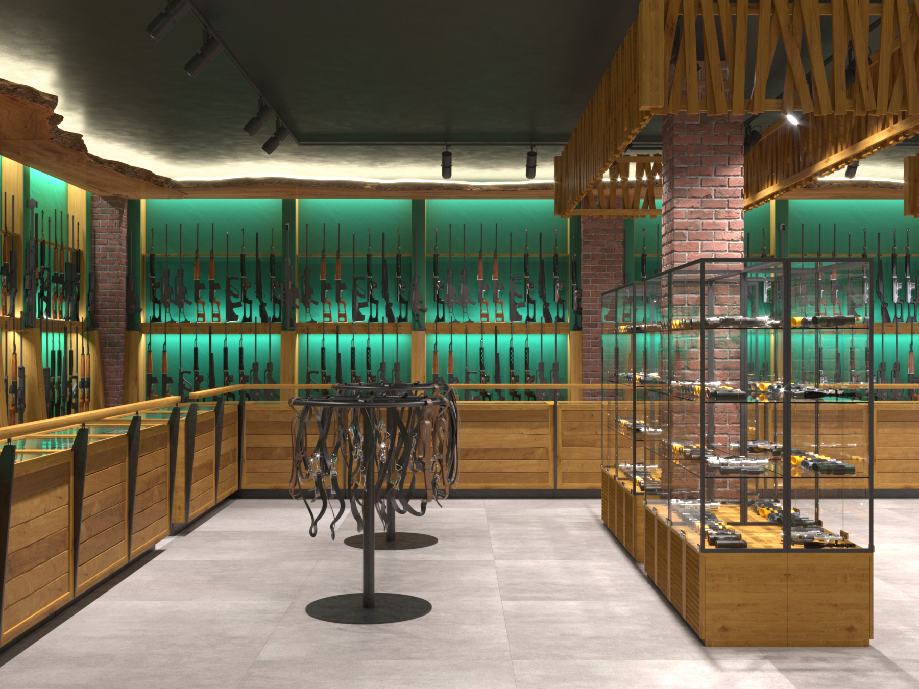
Above the stands with products, a cash desk, an online purchase counter, and so forth, an accent structure constructed of wooden slats imitating a gate was put. It draws attention, helps to navigate the room better, structures it, and contributes to the interior's integrity.
Along the perimeter of the first floor, right under the ceiling, we placed a massive structure made of a solid piece of wood with an untreated edge. It is not only a decorative element that adds natural pristine to the space. Its function is to raise the ceiling, which works in combination with lighting. Aside from that, an unusual effect: the black ceiling does not produce pressure and does not visually shrink the area, but rather appears to "dissolve" and visually add height.
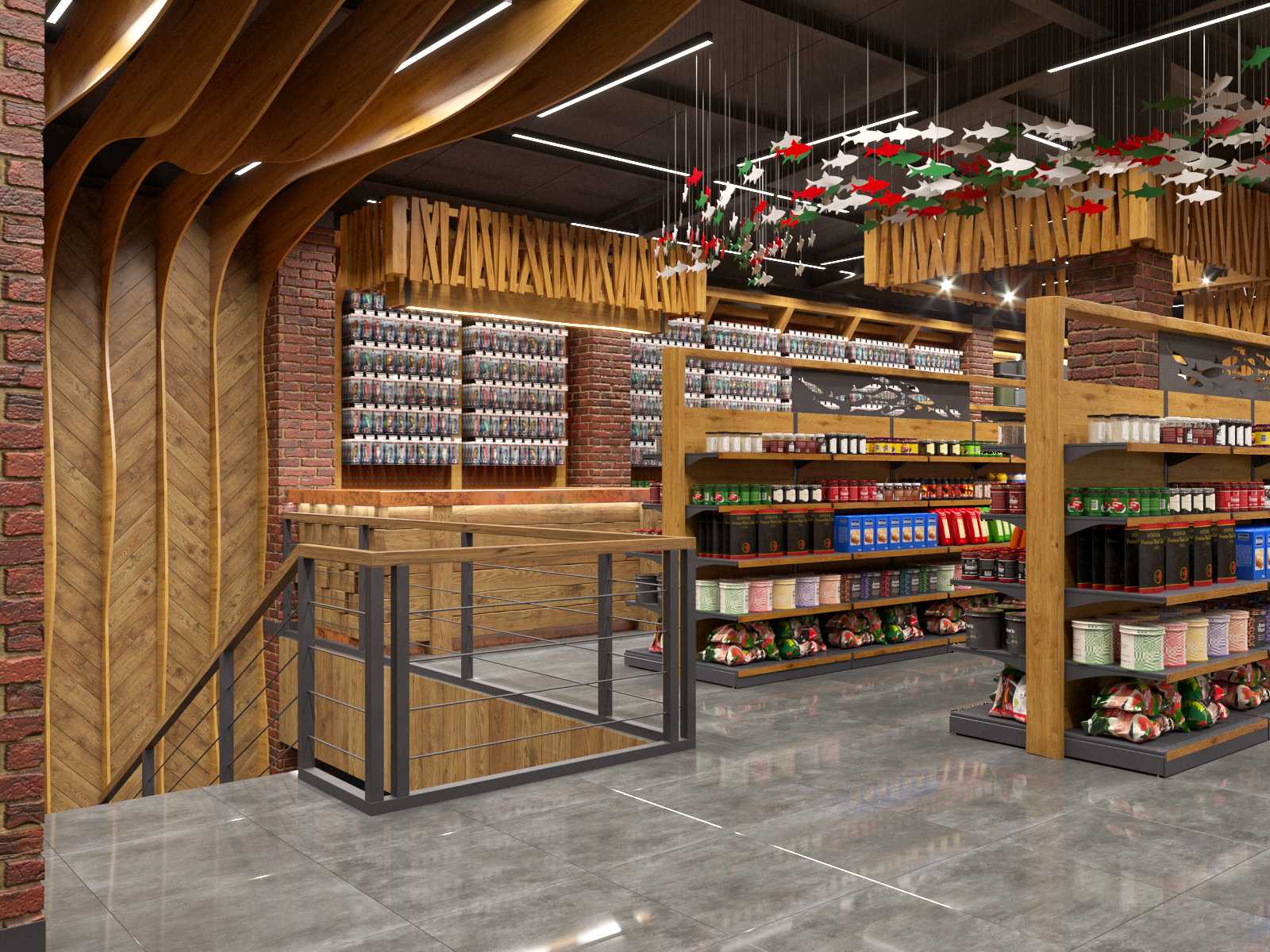
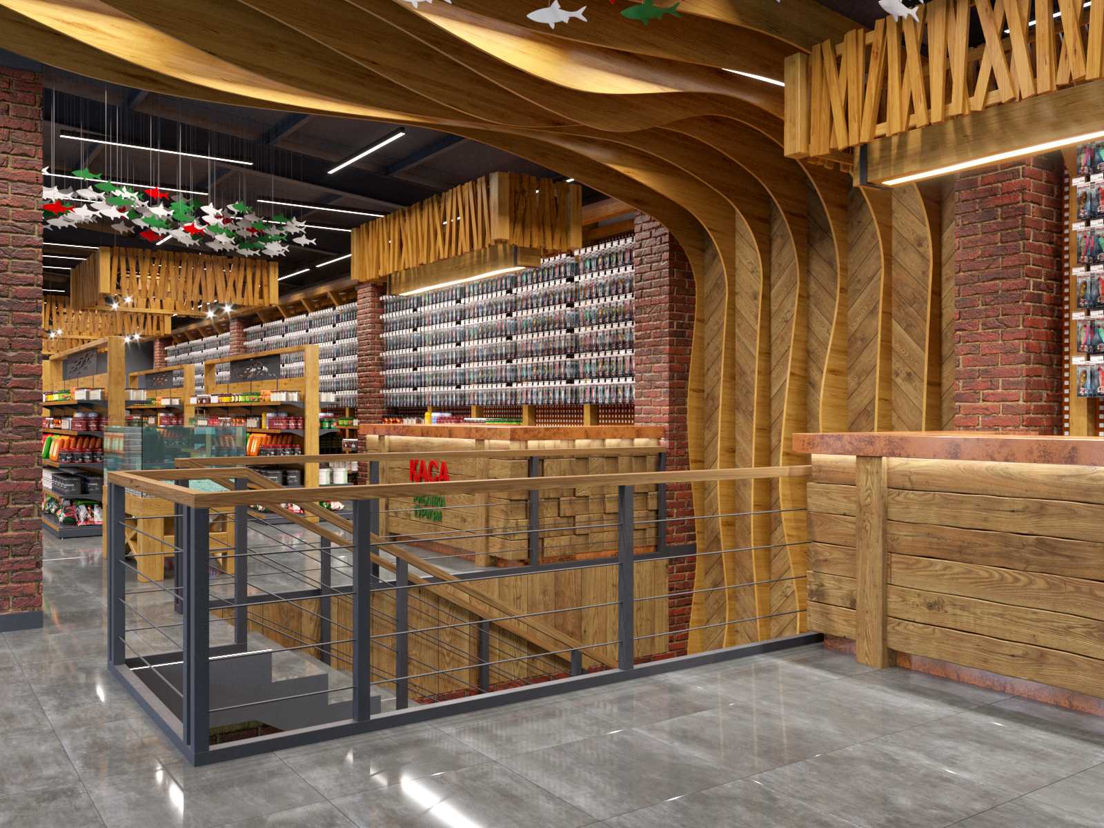
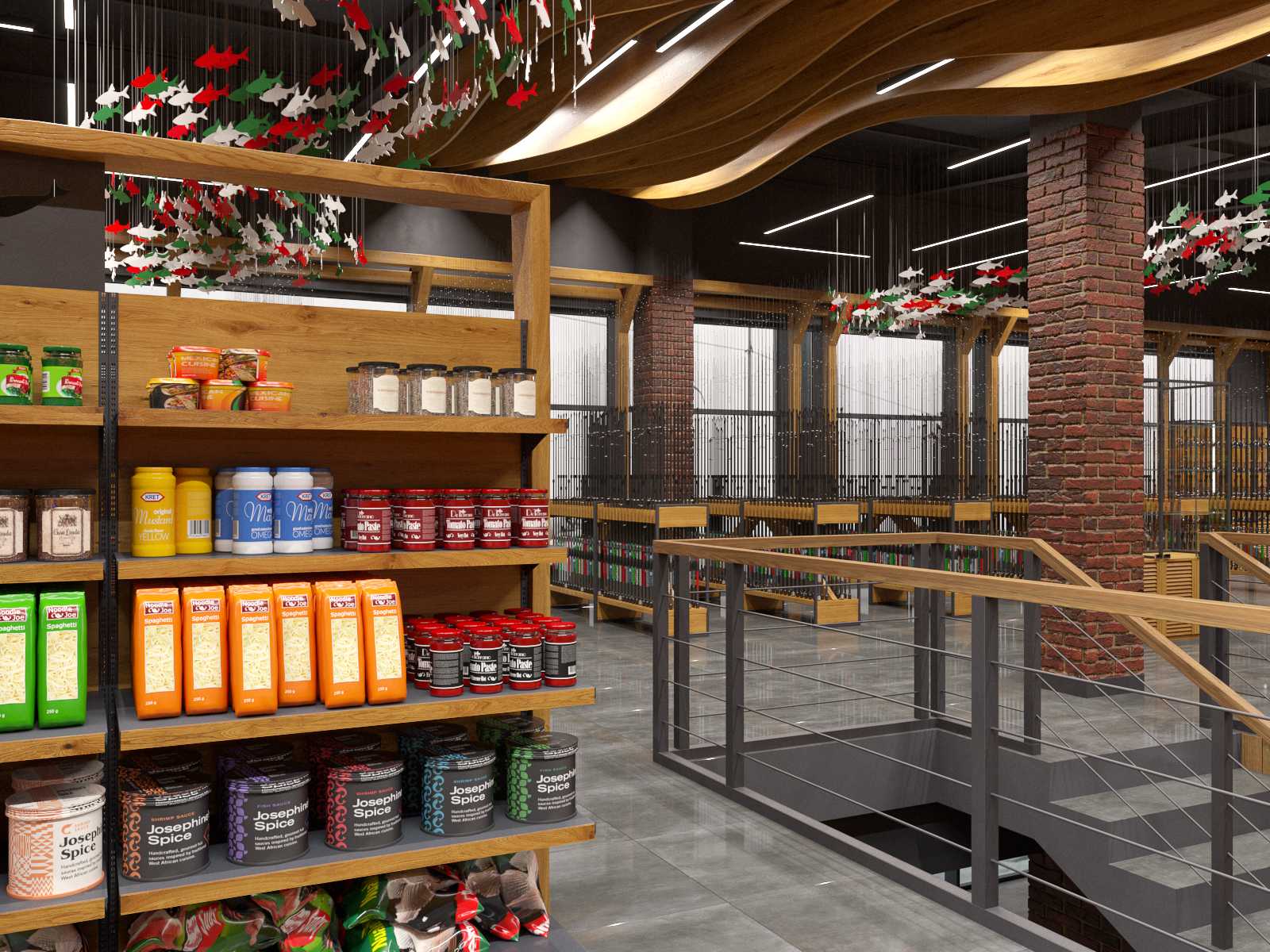
And the third wooden accent is the waves that highlight the staircase area and smoothly pass to the ceiling of the second floor as if catching the client and leading him into the fishing equipment section. It is also played out in other decorative elements: fish in corporate colors that "swim" under the ceiling, patterns on exhibition stands, etc.
The waves that emphasize the staircase area and seamlessly pass to the ceiling of the second floor, as if capturing the customer and leading him into the fishing space, are the third wooden accent. It is also reflected in various visual aspects, such as fish in corporate colors that "swim" beneath the ceiling, patterns on display stands, etc.
In this project, we worked a lot with light. According to legal and safety requirements, weapons must be kept in a completely closed room, so we used flush-mounted lighting, creating the effect of daylight coming through the cracks from the street. We developed different spotlights for each product group to make them look aesthetically pleasing so that the customer could see all the details clearly and at the same time, so that it was not too bright, which is not comfortable for employees and guests.
We also paid a lot of attention to the ergonomics of the interior. For example, there are wide wooden railings along the arms stands, which you can comfortably lean on while looking at the goods. In all rooms except the cash desk, a separate counter was added where the salesperson can advise the customer and demonstrate the goods.
- Square 800 m²
- Location Kyiv, Ukraine
