Restaurant on Podil
We turned a well-known coffee shop in Kyiv's Podil into a fancy restaurant but preserved the past format for its lovers, and this was a challenge.
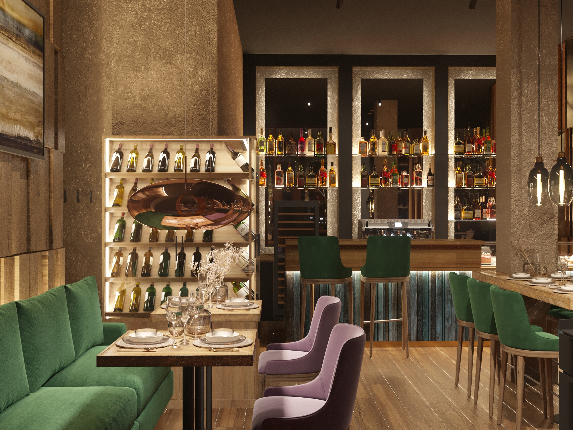
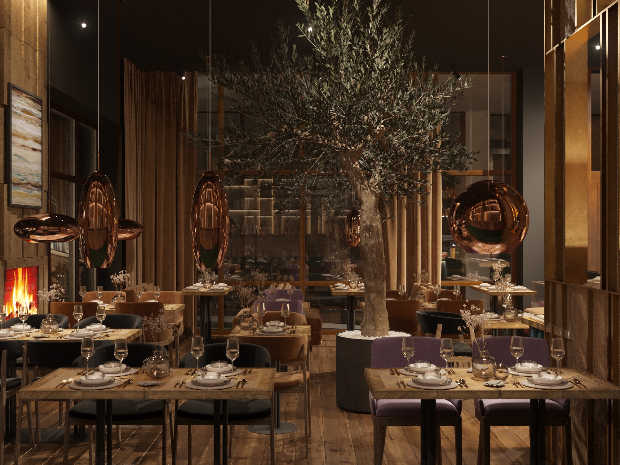
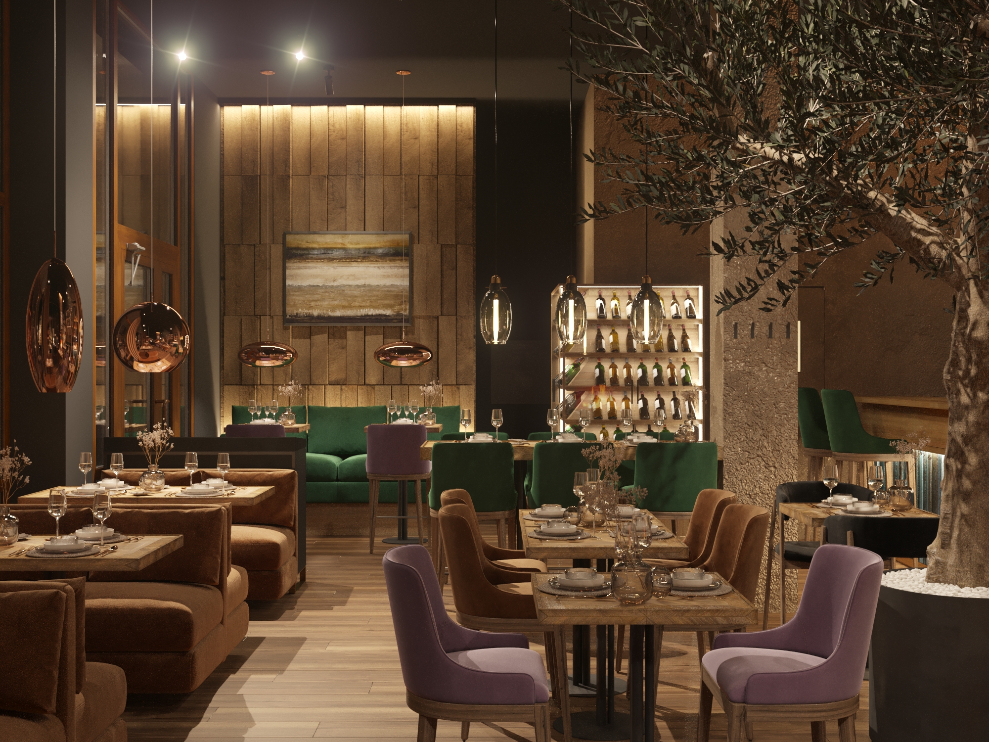
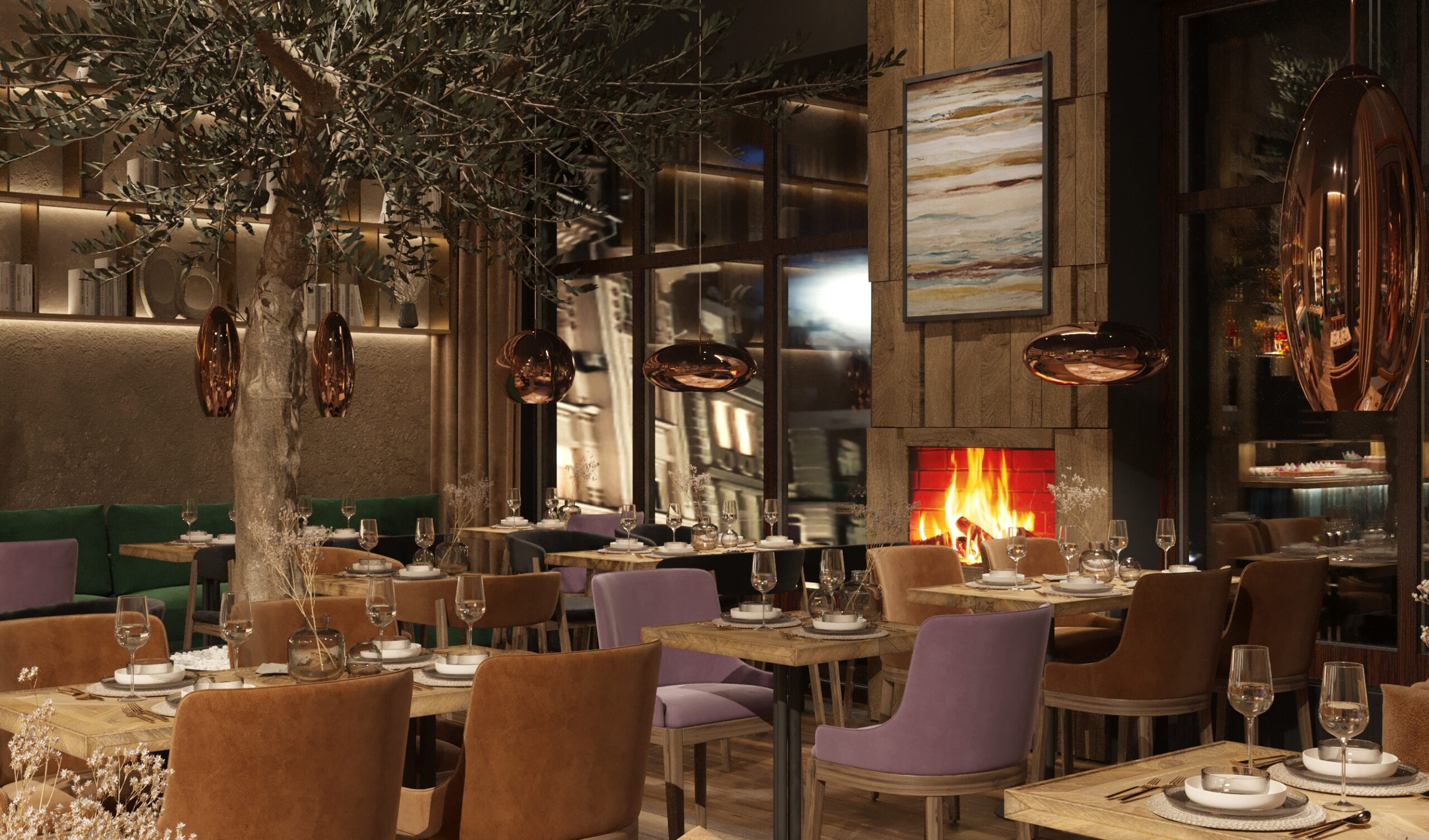
Transforming the space into a restaurant, we focused on the atmosphere making sure it will encourage you to stay here longer, enjoy the coziness, leisurely eat, drinking a glass of wine. The use of different textures, colors, and lighting played the biggest role in this.
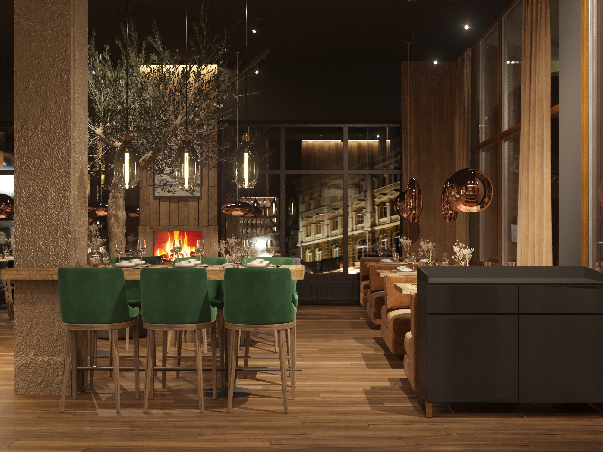
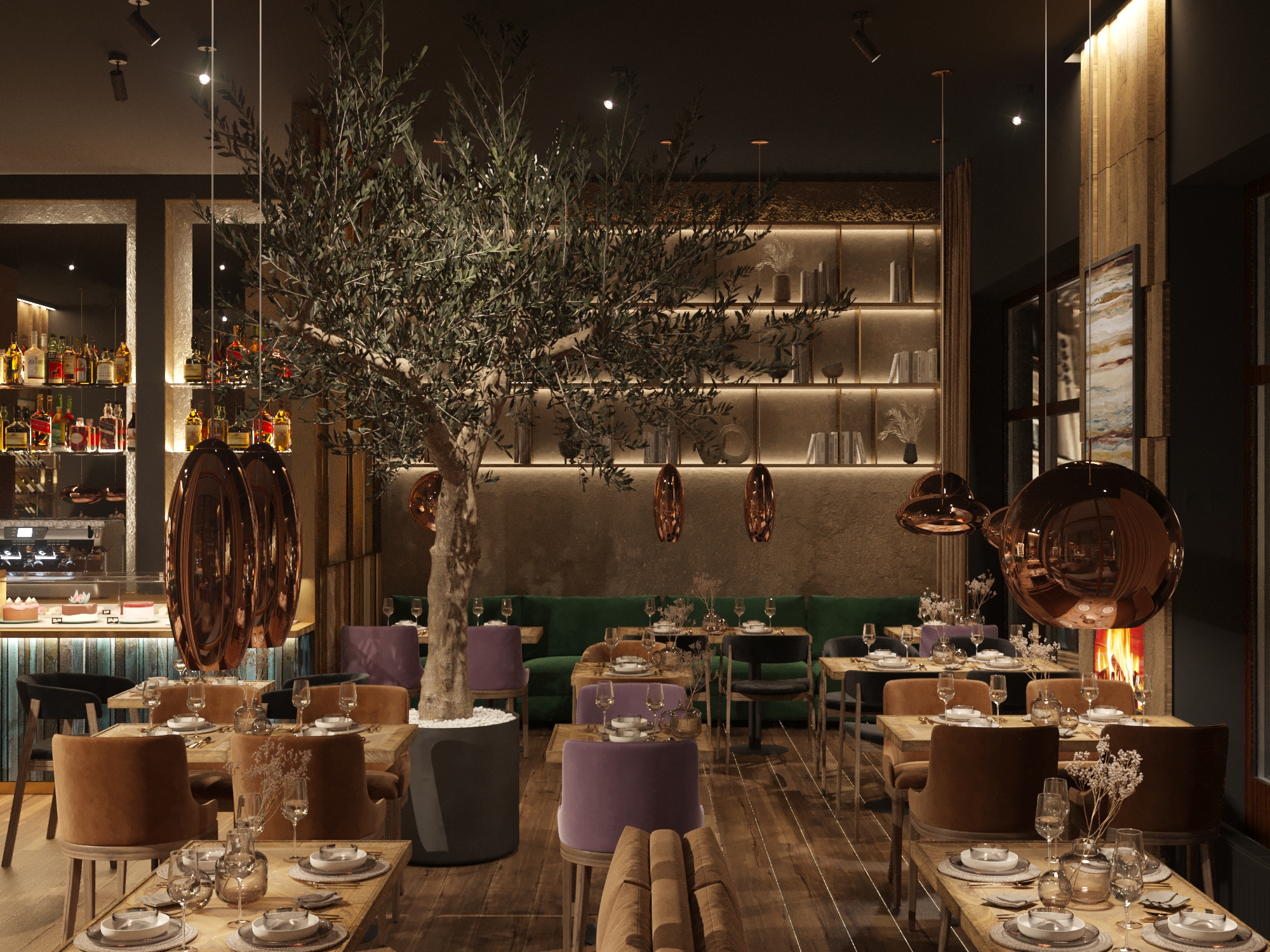
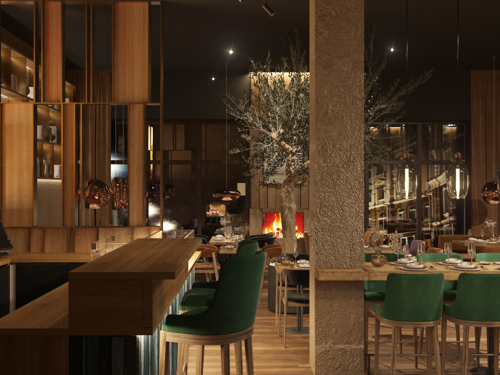
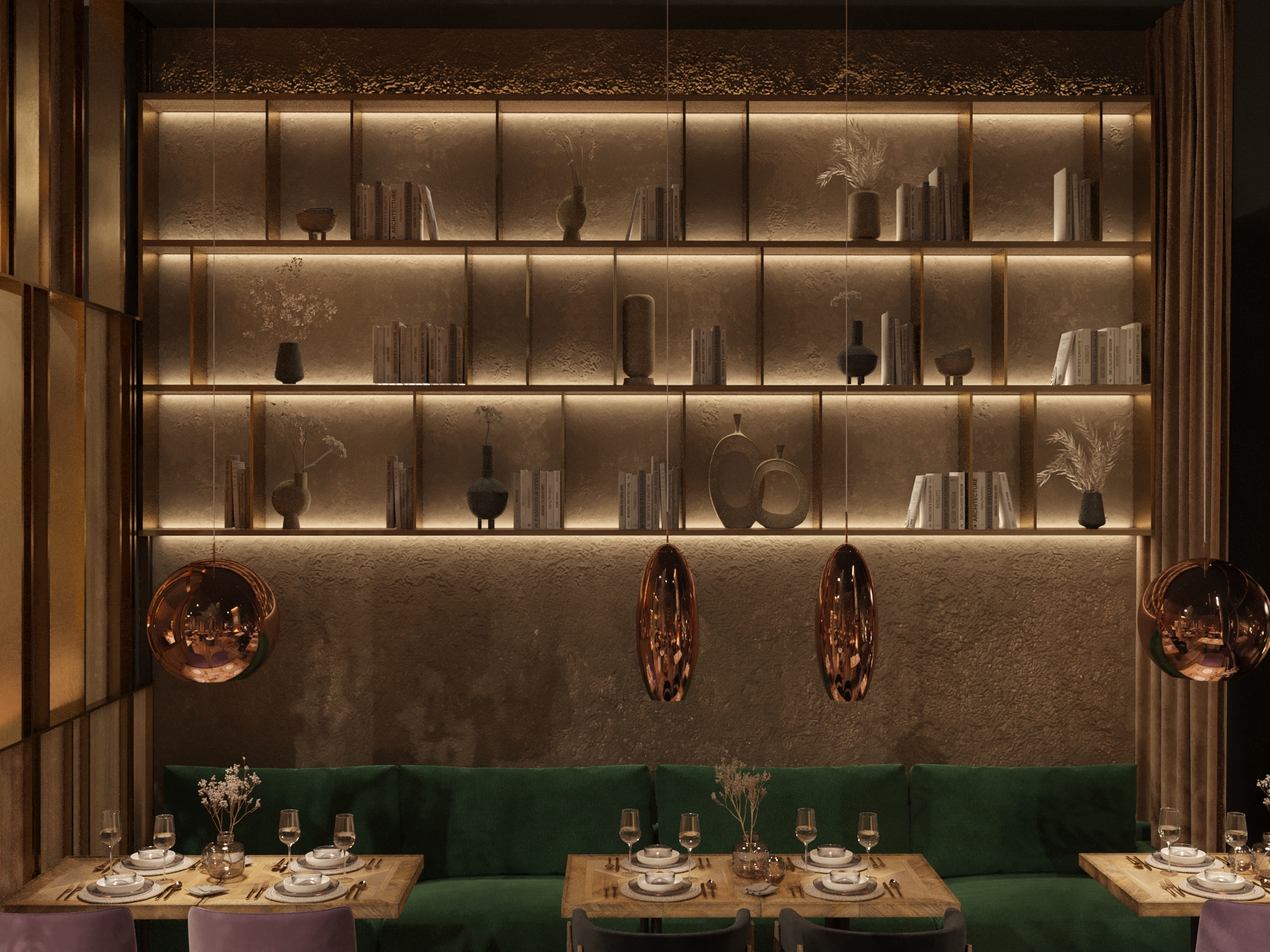
We chose light wood and beige walls in combination with a dark gray ceiling and the same furniture details. In contrast, these shades mutually reinforce each other. A harmonious interspersion of emerald green, pastel purple, and azure blue adds emotionality to the composition.
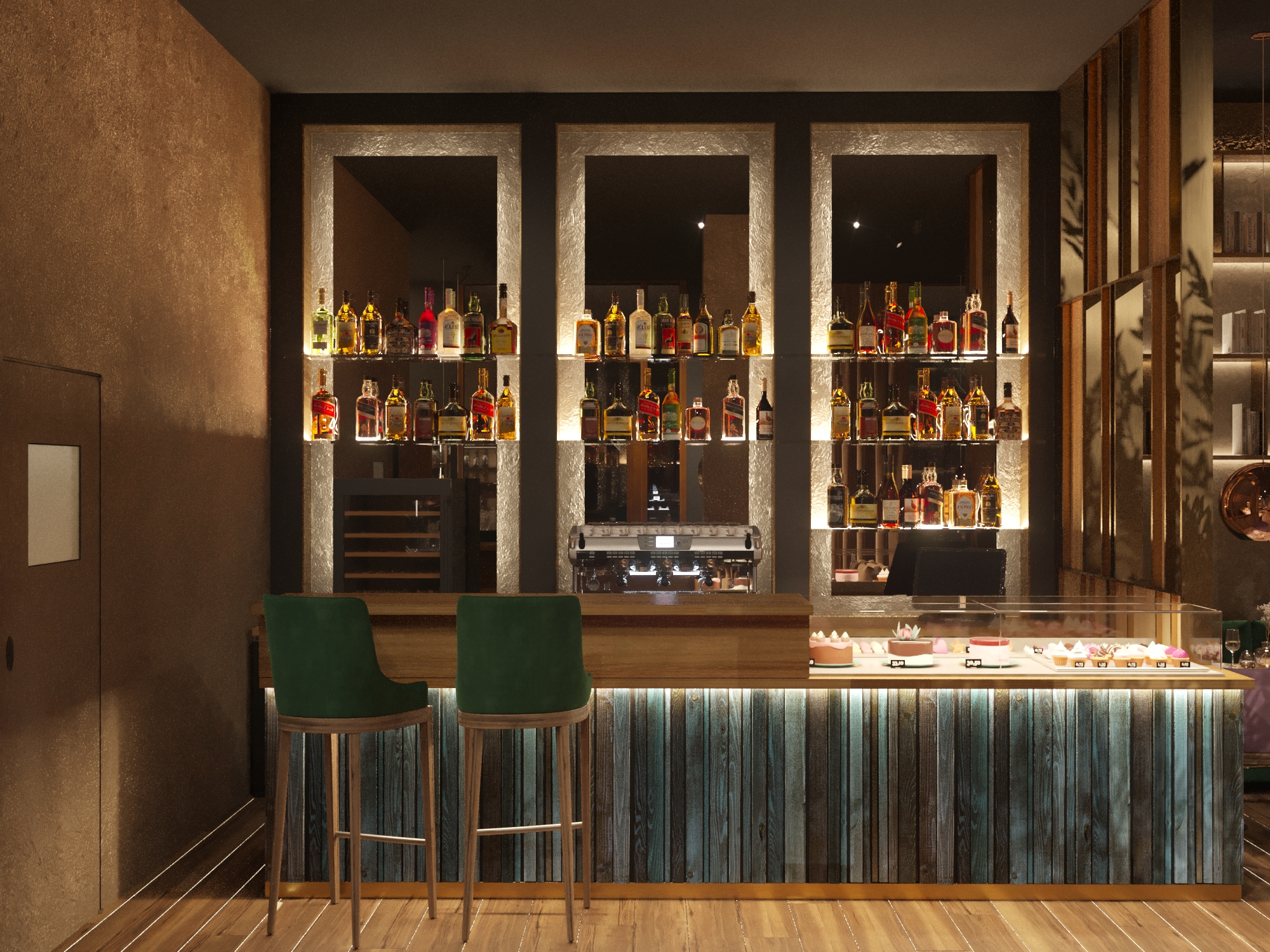
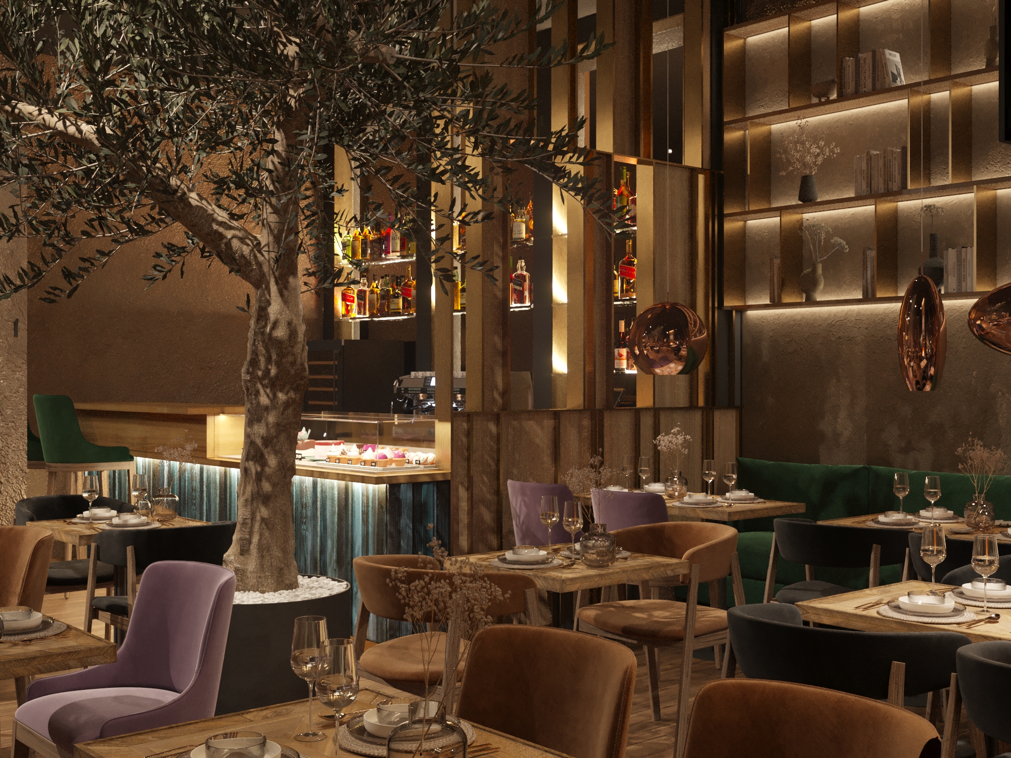
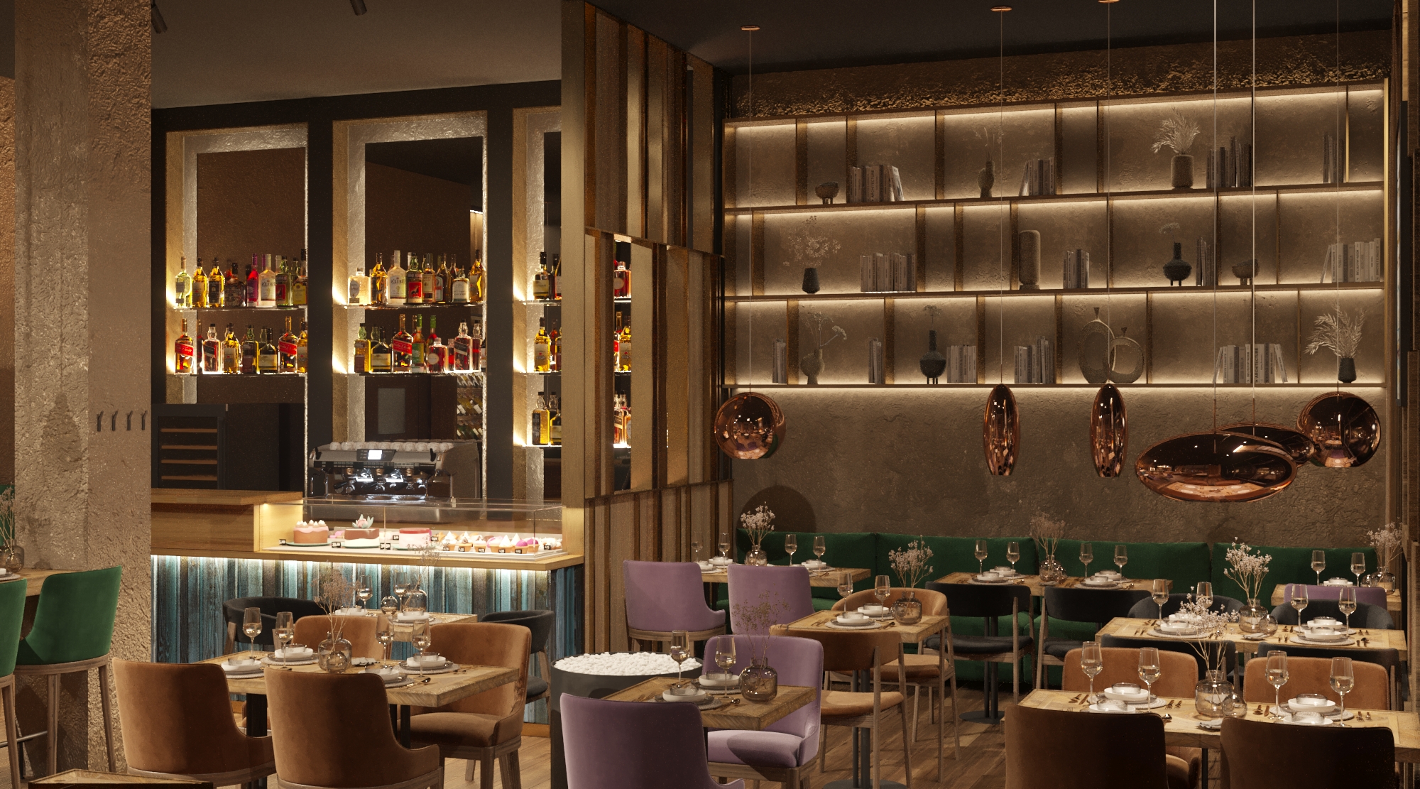
Muted point lighting creates accents without oversaturation while making the space instagrammable. Copper lamps enrich the variety of cozy textures, and reflections on their surface add depth. Shelves with hidden lighting behind them are our unique project, custom-made by a Ukrainian manufacturer, which also adds depth and seems to warm the space.
During the day, panoramic windows fill the space with natural light, creating a more familiar atmosphere for a coffee shop, where it is pleasant to start the day with coffee and cake. By the way, one of the most interesting tasks is working with the glass showcase for the cakes bar. Since it is inappropriate for an evening restaurant format, we figured out how to hide it beautifully and functionally in the evening: a "double" of the wooden part of the bar counter will be placed on the showcase. In this way, it will not be noticeable and there will be no feeling that the showcase does not work, and it will also become an extra place behind the bar. The search for transformations in the interior is always the most interesting.
The semi-transparent screen separating the bar and the hall turned out to be the biggest challenge, which took as much time to work on as the rest of the interior. We were looking for a balance between coziness, spaciousness, minimalism, and economic expediency.
As a result, we found a balance, a contrasting but harmonious transformation of the formats of the space, and bright accents without oversaturation, which in overall solves the client's business goal to attract a new audience without losing the old one. A bold, yet cautious approach.
- Square 80 m²
- Location Kyiv, Ukraine
